Archive for the ‘data visualization’ Category
Visualizing disease incidence in the context of socioeconomic factors
Disease incidence is usually connected to biological factors such as genetics, eating habits, exercise and so on. But are there are other socioeconomic factors that influence disease incidence as well? This TED talk from Bill Davenhall inspired us to explore socioeconomic factors that may influence disease incidence.
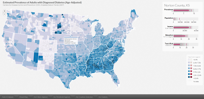
To explore the connections of socioeconomic factors such as education levels, regional population, income level of the area where you live and the air pollution in terms of toxic levels, we developed a visualization tool called DiseaseTrends. DiseaseTrends allows the exploration of possible correlations between those socioeconomic factors with diabetes prevalence and cancer incidence rates across counties throughout the United States. A user can interactively explore these factors at a county, regional (user defined cluster of counties), state or national level.
When a user explicitly selects a county, we display 5 similar counties based on their socioeconomic factors. The motivation behind this feature is to allow users to identify similar counties that may have varying disease incidence rates, which may in turn lead to further exploration.
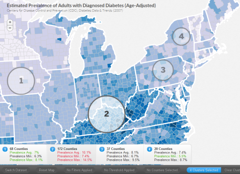
As mentioned above, a user can specify regions manually that cross state boundaries. A user defined circular cluster can be specified using Ctrl on PC, Cmd on Mac – then click and drag. Here the user has specified four regions. The maximum prevalence (in red) and the minimum (in green) across the selected region is highlighted in the panels below.
We use bullet graphs (pdf link) as introduced by Stephen Few to display the quartile distribution of a factor as well as the corresponding state and national average (faint and dark vertical bars).
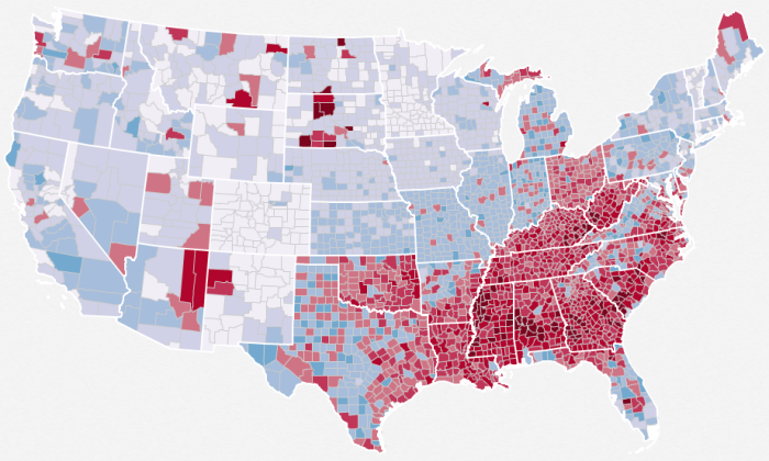
Through this tool, we can easily see the now popular diabetes belt, as shown here
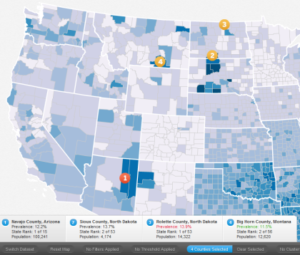
High incidence rates in Native Indian reservations such as Navajo County, Sioux County, Rolette County and Big Horn County too can be seen.
We would like to mention that DiseaseTrends does not imply any causation and can merely hint at possible associations. It is completely up to a researcher in the field of public policy / public health to further investigate the findings.
More details about DiseaseTrends can be found in our paper.
Visualization for Fraud Detection
Data visualization is being used for detecting fraud, especially with respect to wire and credit card transactions. Work done at the Charlotte Visualization Center at UNC Charlotte provides some interesting insights into fraud detection. This work was conducted in collaboration with the Bank of America.In the following paper they highlight four visualization techniques that allow for fraud detection.
Scalable and Interactive Visual Analysis of Financial Wire Transactions for Fraud Detection, Remco Chang, Alvin Lee, Mohammad Ghoniem, Robert Kosara, William Ribarsky, Jing Yang, Evan Suma, Caroline Ziemkiewicz, Daniel Kern, Agus Sudjianto, Journal of Information Visualization (IVS).
Heatmap: A heatmap depicting the relationship between accounts and transactions.
Search by example: Find accounts with transactions/activity similar to the current account being monitored.
Strings and beads: A line graph based visualization that shows critical events as ‘beads’ on the graph. The use of a log scale for the y-axis is a neat idea and probably allows for improved exploration. 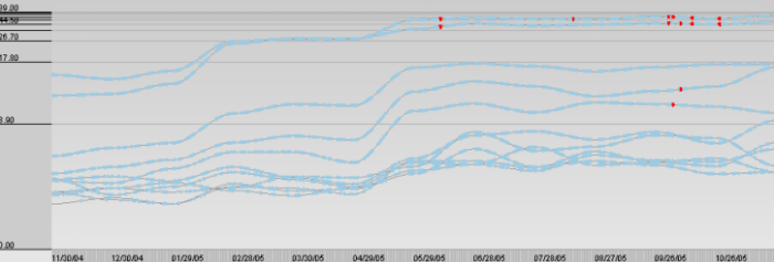
Keyword graph: A graph visualization showing keyword similarity 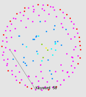 This paper was based on previous work done by the same group titled Wirevis. I would encourage interested readers in reading the original paper as well as the previous paper (Wirevis).
Centrifuge Systems, a Virginia based company, have developed data visualization software for fraud analysis.
- It is a web-based solution that allows interactive exploration of data for fraud detection.
- Can read a wide variety of file formats (excel/access databases).
- Allows interaction with visualizations such as node-link diagrams, bar charts etc.
You can check out a 10-min video on their website at http://www.centrifugesystems.com/shadowbox/libraries/mediaplayer/Centrifuge-1.8-for-Banking-Fraud-Analysis.flv. As per the company website, it has been used to detect fraud in Bulgaria called the “Bulgarian Money Mule ring”. Seems like a step in the right direction. It would be interesting to see, if they could save and share workspaces for collaborative exploration of data. With their web-based framework, it would make it particularly interesting for investigators located at different locations to immediately access and interact with the current state of the visualization.
Any other companies, products, research papers that you may have heard of that I missed?
Data Visualization Talks Online
Lately, I have been collecting links to videos of talks related to Data Visualization. I found multiple talks for some people and so have categorized them accordingly. I have also tried to provide some context to the individual/group.
I think the first TED talk by Hans Rosling (@hansrosling) got a lot of media attention and made people sit up and appreciate the power of ‘narrative visualization’. He almost make it look like a sport with him serving as the role of a commentator. The title on TED’s website for the talk is “the best stats you’ve ever seen“. I am not sure about that, but it is a very entertaining talk.
It was followed up by an interesting study by information visualization researchers George Robertson, Roland Fernandez, Danyel Fisher, Bongshin Lee and John Stasko in the Infovis 2008 paper titled “Effectiveness of Animation in Trend Visualization.” Here is an interesting excerpt from the abstract of the paper:
Results indicate that trend animation can be challenging to use even for presentations; while it is the fastest technique for presentation and participants find it enjoyable and exciting, it does lead to many participant errors. Animation is the least effective form for analysis; both static depictions of trends are significantly faster than animation, and the small multiples display is more accurate.
Hans Rosling was back again at TED 2007 with “New Insights on poverty” and has spoken many times since at TED.
Fernanda Viégas and Martin Wattenberg (@wattenberg) (previously at IBM Research) have brought visualization to the masses in through IBM Many Eyes. They have recently started a new venture called FlowingMedia. Here are some links to their talks:
- TEDxSP 2009 – Fernanda Viégas (in Portuguese with english subtitles)
- Stanford CS Department – Democratizing Visualization (wmv)
Manuel Lima (@mslima) of visualcomplexity.com gave an interesting talk at Made by Many. His talk titled Network Visualization in an Age of Interconnectedness was not only an excellent talk, but ended up starting quite a passionate debate which led to Manuel writing a post titled Information Visualization Manifesto. I urge you to read the post and look at the interesting perspectives that infovis experts in the field had to Manuel’s manifesto. Manuel gave another interesting talk at the Creativity and Technology (CaT) 2009: Information Visualization.
Aaron Koblin (@aaronkoblin) has been involved with creating innovative and evocative data visualization pieces such as the New York Talk Exchange, Radiohead’s House of Cards music video (You can see Aaron in the “Making of House of Cards” video), the very entertaining ‘Bicycle built for 2000‘ project and many others.
Making of House of Cards
Links to a couple of Aaron’s talks are below:
- Visualizar 09 – Data Visualization and Art
- CaT 2009 – The Wizard of Data Art, Aaron Koblin
Tom Wujec is a fellow at Autodesk. His talk on 3 ways the brain creates meaning provides an amazing insight into our brain. He addresses issues related to why data visualization works and how the brain visualizes data.
Jeff Heer has developed information visualization tools that can be used by developers around the world for creating interactive visualizations of their own data. He is the authors of Prefuse, Flare (Check out the excellent demos) and most recently, Protovis (many great examples online). Lately, he has published an informative articles in the ACM Queue titled A tour through the visualization zoo – Jeffrey Heer, Michael Bostock, Vadim Ogievetsky. He does a great job interviewing Fernanda Viegas and Martin Wattenberg in the ACM Queue. A talk by him at the Stanford HCI seminar can be found here (html link, wmv).
Alex Lundry (@alexlundry) presents a very interesting point of view in his talk – “How visualization changes everything“.
Nicholas Christakis presents a very fascinating talk where he used social data visualization to explore the influence of social networks – “The hidden influence of social networks.” In his talk he says that spreading of obesity is due to your social network. Smoking and even divorce can be linked to the company you keep.
Sebastian Wernicke presents a light hearted look where he analyzes TED talks and presents some statistics based on the analysis in his talk – Lies, damned lies and statistics (about TEDTalks)
Please let me know if I have missed any interesting data visualization talks that are available online and I will be happy to update the post.
Interactive visualization at your fingertips
 With today’s release of Tableau Public, Tableau Software has opened up infinite possibilites for researchers, corporations and enthusiasts alike to interact, explore and play with their data. More importantly, with Tableau Public one can now have ‘interactive’ visualizations online as opposed to static images. This is a step in the right direction for Data Visualization software, since increasingly one hears from domain experts who want to ‘use’ software and not have to write programs (however small or easy those programs may seem to the developer of the software). Tableau now allows researchers to explore their data and collaborate more effectively instead of having to share static ‘screenshots’ via email.
Such uses of visualization software have already been explored and shown to be hugely successful by the ManyEyes team in their CHI ’08 paper, but the capabilities and strengths of both the products are in somewhat disjoint areas. For example, Tableau focuses on the Business Intelligence community and lacks certain visualizations such as Treemaps or Text visualizations (which ManyEyes seem to do really well). Other interesting and inspiring uses of Tableau Public can be found in their Gallery at http://www.tableausoftware.com/public/gallery. Dont forget to check out the NYC Graffiti workbook that they have online. Detailed training videos can be found at http://www.tableausoftware.com/public/training
ManyEyes – Reader  s of this blog already know my fondness for IBM’s Many Eyes. ManyEyes has been a pioneer in this field of online visualization software that facilitates data visualization without the need for programming. Research papers from the Many Eyes team detailing user interactions and unexpected uses of the visualization software can be found at http://bewitched.com/manyeyes.html
Verifiable is another  such website that allows online visualization of data. So far the data visualizations that are possible are limited to bar charts, scatter plots and line charts but the trend is definitely promising and I hope they continue to improve the excellent service. A video can be found online at http://verifiable.com/screencast
Swivel is similar to  Verifiable, where one can upload data and create online interactive visualizations. Videos for all the features in Swivel can be found at http://www.swivel.com/features. Unfortunately, they have a 15-day free trial that restricts the widespread use of their tools.
As I interact with experts and students from domains as wide as political sciences, biology, economics and so on, I am pleased to hear the awareness that they have for effective visualization but I am sometimes disheartened to have to tell them to learn programming to learn some of our nifty tools. Tableau Public, IBM Many Eyes and others are exceptional in the service that they provide. I envision more research groups, corporate websites and so on posting interactive visualizations with a ‘Powered by Tableau’ icon or something similar in the bottom right corner.
Redesigned Visualizations
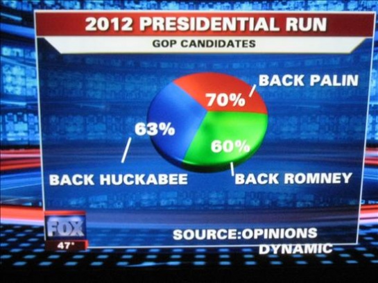
Lately, we have been seeing a high number of ‘bad’ visualizations in media. Over at Infosthetics, they even had a contest to identify the ‘Most Ugly and Useless Infographic‘. It was worth a few chuckles but it definitely made one realize the importance of effective data visualization. It is unfortunate that some people have to make decisions based on such visual representations.
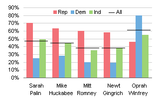
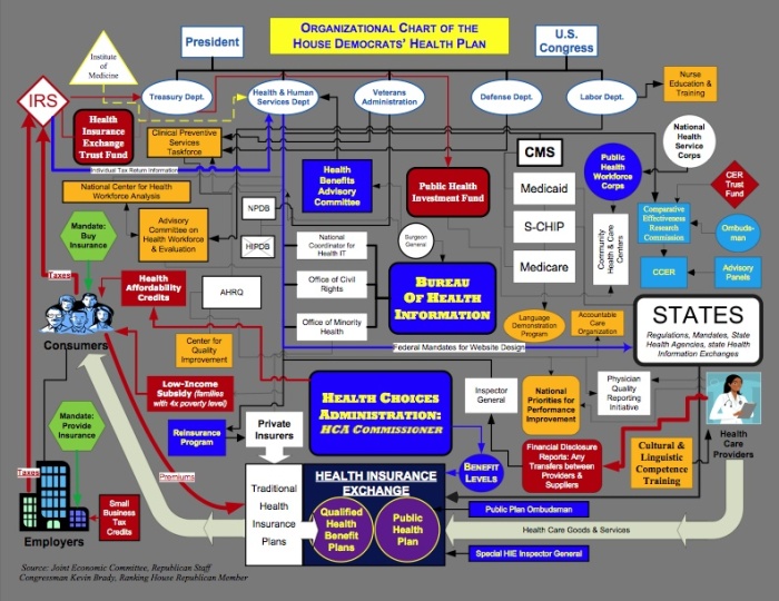
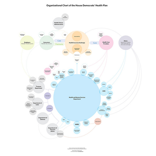
More than just looking at bad visual representations, there seems to be an increasingly constructive trend of redesigning graphs/visualizations that seem to get very popular in media. I wholeheartedly support this endeavor and hope to see more. It is naturally easy to criticize other visualizations, but redesigning it to ‘put your visualization where your mouth is’ takes courage. Here are a few examples.
If you have seen any other interesting visualization critiques, please send them my way and I shall be happy to update this post.
Big car, Small car – Which one is safer?
As a new parent, I have always been guilty of driving a compact car when everyone around me keeps telling me that even though SUV’s are bad for the environment they are so much safer in case of an accident. I cringed a bit at every such discussion but thought that maybe they had a point.
But then I thought why not use data visualization to get to the bottom of this and find out what the truth is. Let me preface this by saying that this is my first attempt at visualizing the data I could find for free and any visualization suggestions or data sources that you are aware of will be greatly appreciated.
[Note: No fancy visualizations here 🙂 Only good old bar graphs]
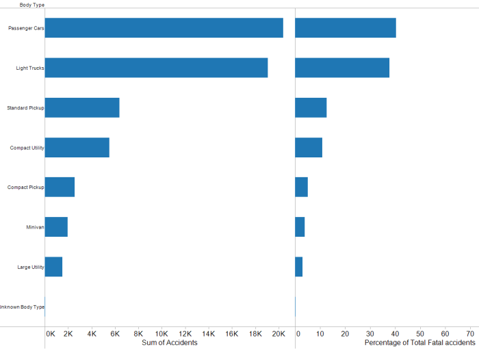
Step 1 – Type of the car vs Fatalities
I first wanted to find out what is the breakdown of car crashes as compared to the type of car. I found that there is extensive data (see data sources below) about car crashes and fatalities. I decided to use fatalities as a measure of how ‘safe’ the car is and so this graph shows the type of car as compared to the fatalities in 2008. I was sad to see that ‘Passenger cars’ were ranked first but happy to see that ‘Light trucks’ were pretty high up too. Minivans, Compact utility and Large Utility vehicles had far fewer fatalities and I was worrying whether my worst fears (SUV/Minivan = safer) were coming true.
Step 2 – Sales for each type of car
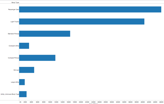
But then I thought that the number of accidents obviously is very dependent on the number of cars that get sold per year and if more passenger cars were getting sold, then more of them would be in a fatal accident thus giving it a higher number. So I found out what the car sale numbers were for 2008 (see data source below) and decided to plot that.
Step 3 – Comparing the Fatalities/Sales ratio
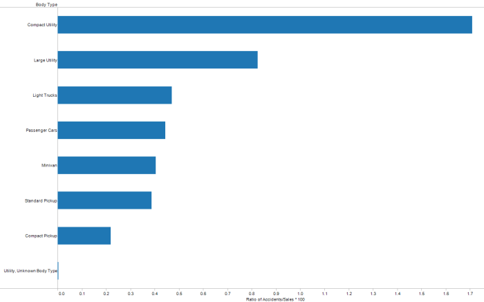
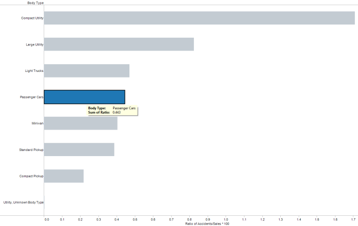
Then the next obvious thing to do was to compute a ratio of the number of fatal accident per type of car with the number of cars sold for that type in a year. On computing the ratio, I found something very interesting. Sorting the graph based on this ratio, I found that Compact Utility vehicles had the highest ratio of fatal accidents to sales. If you look at the first graph, you will see that the compact utility vehicles do not have a large amount of fatal accidents to begin with, but then when that number is divided by the total amount of compact utility vehicles sold, we find an interesting insight (much to my relief and joy).
Passenger cars have a lower ratio than Compact utility vehicles, Large utility vehicles and Light trucks. 🙂
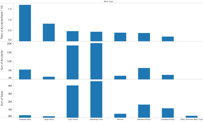
Anyone who has used Tableau has probably already guessed that all these visualizations were created using Tableau Software and so I visualized the Ratio, Fatal Accidents, Sales all in one image. It shows clearly how compact utility vehicles have a high ratio even though trucks and passenger cars have higher fatalities and more cars of those types were sold.
My current data sources are (Please let me know if you are aware of better ones):
Fatality analysis reporting system – http://www-fars.nhtsa.dot.gov/States/StatesCrashesAndAllVictims.aspx
WSJ – Car sales for the year so far – http://online.wsj.com/mdc/public/page/2_3022-autosales.html
Things to look out for at InfoVis 2009

InfoVis (Information Visualization) 2009 is an integral part of the Annual VisWeek conference. This year the VisWeek conference will be held in Atlantic city, NJ from October 11th-16th. In the next few posts, I shall post my views on things to look out for in each of the tracks at the VisWeek conference: VAST, Vis and Infovis. Here are some exciting talks/panels/workshops/tutorials that I’m looking forward to at InfoVis this year (Links and other material shall be updated as material becomes available):
Workshops:
Collaborative Visualization on Interactive Surfaces (CoVIS)
Organizers: Petra Isenberg, Michael Sedlmair, Dominikus Baur,
Tobias Isenberg, Andreas Butz
Tutorials:
Visualization and Analysis Using VisIt
Organizer: Hank Childs
Exploring Design Decisions for Effective Information Visualization
Organizers: Jo Wood, Jason Dykes, Aidan Slingsby
Keynote: Visual Thinking and Visual Thinking Tools
Speaker: Colin Ware, Data Visualization Research Lab, University of New Hampshire
Panels:
Changing the World with Visualization
Organizer: Robert Kosara
Panelists: Sarah Cohen, Jerome Cukier, Martin Wattenberg
Papers:
InfoVis Best Paper Award
ABySS-Explorer: Visualizing Genome Sequence Assemblies
Cydney B. Nielsen, Shaun D. Jackman, Inanç Birol, Steven J.M. Jones
InfoVis Best Paper Award
Mapping Text with Phrase Nets
Frank van Ham, Martin Wattenberg, Fernanda B. Viégas
InfoVis Honorable Mention
MizBee: A Multiscale Synteny Browser
Miriah Meyer, Tamara Munzner, Hanspeter Pfister
InfoVis Honorable Mention
Configuring Hierarchical Layouts to Address Research Questions
Aidan Slingsby, Jason Dykes, Jo Wood
InfoVis Honorable Mention
SellTrend: Inter-Attribute Visual Analysis of Temporal Transaction
Data, Zhicheng Liu, John Stasko, Timothy Sullivan
Spatiotemporal Analysis of Sensor Logs using Growth Ring Maps
Peter Bak, Florian Mansmann, Halldor Janetzko, Daniel A. Keim
A Nested Model for Visualization Design and Validation
Tamara Munzner
“Search, Show Context, Expand on Demand”: Supporting Large Graph Exploration with Degree-of-Interest
Frank van Ham, Adam Perer
A Comparison of User-Generated and Automatic Graph Layouts,
Tim Dwyer, Bongshin Lee, Danyel Fisher, Kori Inkpen Quinn, Petra Isenberg, George Robertson, Chris North
Visualizing Social Photos on a Hasse Diagram for Eliciting
Relations and Indexing New Photos, Michel Crampes, Jeremy de Oliveira-Kumar, Sylvie Ranwez, Jean Villerd
Bubble Sets: Revealing Set Relations with Isocontours over Existing Visualizations
Christopher Collins, Gerald Penn, Sheelagh Carpendale
Temporal Summaries: Supporting Temporal Categorical Searching, Aggregation and Comparison
Taowei David Wang, Catherine Plaisant, Ben Shneiderman, Neil Spring, David Roseman, Greg Marchand, Vikramjit Mukherjee, Mark Smith
Lark: Coordinating Co-located Collaboration with Information Visualization – YouTube Video – Paper link
Matthew Tobiasz, Petra Isenberg, Sheelagh Carpendale
Harnessing the Web Information Ecosystem with Wiki-based Visualization Dashboards
Matt McKeon
SpicyNodes: Radial Layout Authoring for the General Public
Michael Douma, Grzegorz Ligierko, Ovidiu Ancuta, Pavel Gritsai, Sean Liu
code swarm: A Design Study in Organic Software Visualization
Michael Ogawa, Kwan-Liu Ma
Protovis: A Graphical Toolkit for Visualization
Michael Bostock, Jeffrey Heer
Participatory Visualization with Wordle
Fernanda B. Viégas, Martin Wattenberg, Jonathan Feinberg
Capstone: Visual aids: Use of Paintings and Photography for Lighting in the Theater
Speaker: Brian MacDevitt, Broadway Lighting Designer
Things to look out for at VAST ’09
VAST is the Visual Analytics track at the Annual VisWeek conference. This year the VisWeek conference will be held in Atlantic city, NJ from October 11th-16th. In the next few posts, I shall post my views on things to look out for in each of the tracks at the VisWeek conference: VAST, Vis and Infovis. Here are some exciting talks/panels/sessions that I’m looking forward to this year (Links and other material shall be updated as soon as the papers are available):
Interactive Visual Clustering of Large Collections of Trajectories,
Gennady Andrienko, Natalia Andrienko, Salvatore Rinzivillo, Mirco Nanni, Dino Pedreschi, Fosca Giannotti
A Framework for Uncertainty-Aware Visual Analytics
Carlos D. Correa, Yu-Hsuan Chan, Kwan-Liu Ma
Parallel Tag Clouds to Explore and Analyze Faceted Text Corpora (YouTube Video)
Christopher Collins, Fernanda B. Viégas, Martin Wattenberg
Describing Story Evolution from Dynamic Information Streams
Stuart Rose, Scott Butner, Wendy Cowley, Michelle Gregory, Julia Walker
Evaluating Visual Analytics Systems for Investigative Analysis: Deriving Design Principles from a Case Study
Youn-ah Kang, Carsten Görg, John Stasko
Visual Analysis of Graphs with Multiple Connected Components
Tatiana von Landesberger, Melanie Görner, Tobias Schreck
VAST Best Paper Award: Iterative Integration of Visual Insights during Patent Search and Analysis
Steffen Koch, Harald Bosch, Mark Giereth, Thomas Ertl
FinVis: Applied Visual Analytics for Personal Financial Planning
Stephen Rudolph, Anya Savikhin, David S. Ebert
Visual Opinion Analysis of Customer Feedback Data
Daniela Oelke, Ming Hao, Christian Rohrdantz, Daniel A. Keim, Umeshwar Dayal, Lars-Erik Haug, Halldór Janetzko
VAST Capstone Panel
How Interactive Visualization Can Assist Investigative Analysis: Views and Perspectives from Domain Experts
Organizer: John Stasko
Panelists: Sarah Cohen, Lawrence Hunter, Joe Parry
Are you planning to come by to the VisWeek conference? Is so, which sessions are you interested in?
Visualizing Environmental Factors
In this post, I focus on the use of visualization in conveying information regarding the environment, pollution, population effects on the planet and similar issues. The visualizations are particularly powerful and make us realize how much of an impact we have on the world.
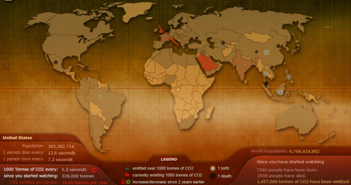
- Breathing Earth is a wonderful visualization that shows a visual representation of the amount of CO2 that is being produced every second. Additionally, based on the statistics there is a neat visual representation of number of births and deaths per second. This image is just a snapshot of the ever evolving visualization. Check out the really eye-opening visualization at http://www.breathingearth.net/
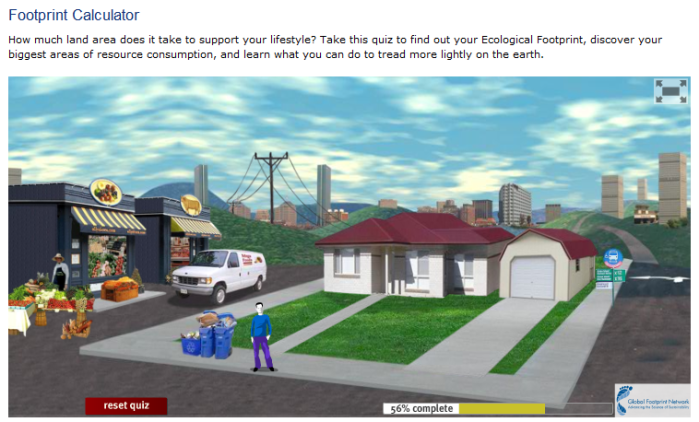
- The Global Footprint Network is an amazing resource that provides information about our footprint on the planet. Other than the excellent scientific resources, they have a quiz that lets you know your carbon footprint at the end. The quiz can be taken at http://www.footprintnetwork.org/en/index.php/GFN/page/calculators/. Here’s a screenshot from the quiz which is really well done.
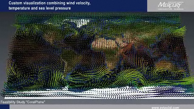
- The Visualization Sciences Group (The company that maintains OpenInventor among other things) has a video showing the amazing capabilities of their visualization software – Avizo Green. The video can be seen at http://www.mc3dviz.com/video/player.php?vfile=avizo/AVIZO_GREEN_mercury640x360.flv. Here is a screenshot from the amazing video. Hedgehogs when visualized over time convey the wind velocity so effectively.
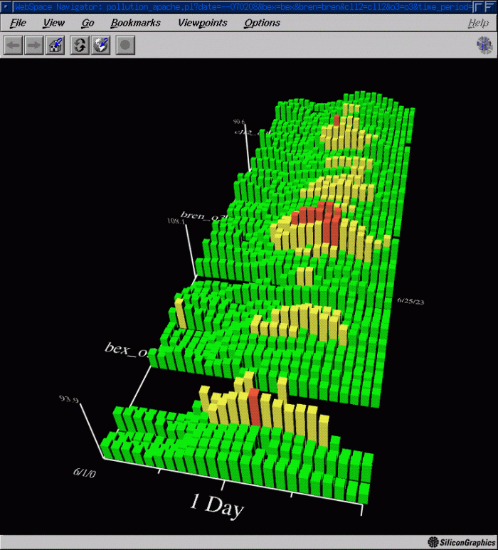
- A research paper by Wood et al. discusses a web-based solution to visualize environmental data. The snapshot below shows a histogram View of Ozone from 3 sites in London – Jason Wood, Ken Brodlie and Helen Wright, Visualization over the World Wide Web and its application to environmental data, Proceedings of IEEE Visualization 1996 Conference, edited by R.Yagel and G.M. Nielson, pp 81–86, ACM Press. ISBN 0-89791-864-9.
- National Public Radio (NPR) had a very informative piece on Visualizing The U.S. Electric Grid – Here are some screenshots from the story. I wonder if they could have picked better visualizations to show the ‘sources of power’.
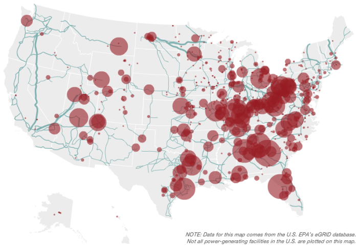
It is a bit hard to visualize the differences in power generating capabilities of various states since the saturation is mapped to a value. Considering there are only a few different values, using different colors may have been a good idea. Any other thoughts on what they could have used to represent this data more effectively?
Here’s another visual representation of the wind energy sources. 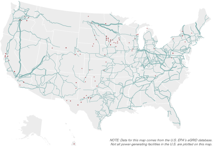
What seemed most interesting to me is how much the US is dependent on coal power as compared to wind. I hope with the new administration’s initiatives for green energy, we will see a change in the near future.
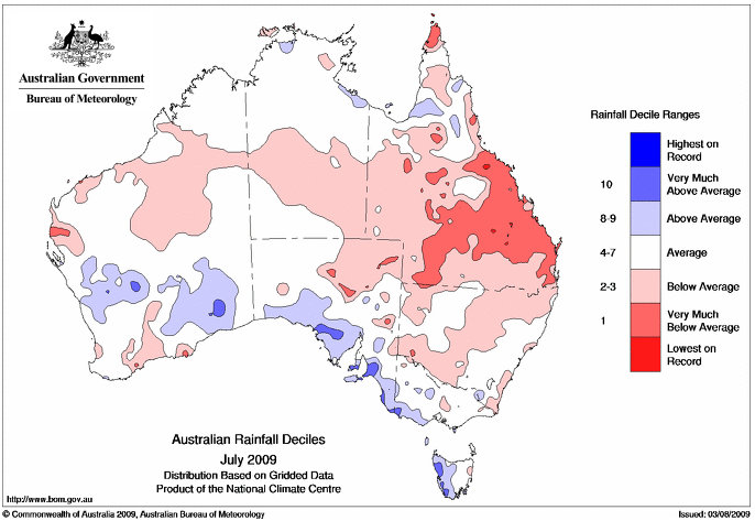
- Visualizing rainfall in Australia – You can interact with the website to pick different visualizations. They seem to be pre-generated though. Here is a screenshot of one of the visualizations
- NY Times article discussing the growing interest in visualizing and drawing attention to the climate change problem through visualization.
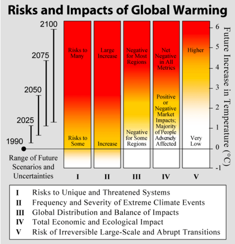
- Globalwarmingart.com is a website dedicated to drawing attention the problem of climate change through the use of visualizations and infographics. Shown here is the now (in)famous ’embers’ graph that the Intergovernmental Panel on Climate Change (IPCC) did NOT include in their report on climate change, since some scientists thought that the visualization “was too unnerving.” Here is the actual figure and its discussion on NYTimes dotEarth blog – http://dotearth.blogs.nytimes.com/2009/02/23/warming-embers-burning-brighter/
- Climate Central – a non-profit organization has some excellent resources that are meant for media and for raising public awareness about the topic of climate change. You can some excellent video as http://www.climatecentral.org/video/. In their own words
Climate Central is an accessible one-stop source for timely, relevant, high-quality climate information through a variety of channels, targeting the media and leaders in business, government, and religion.
- WaterLIFE is a wonderfully informative website that provides information about water. It contains videos, photographs and visualizations that draw your attention to the various factors affecting water. Its a really amazing site and the snapshot below does not do it justice. Anyway, check it out at http://waterlife.nfb.ca/. Here’s a snapshot from their website
Have you seen any other visualization/website that has been used to communicate, inform, educate people about the issues surrounding environmental factors? If so, please feel free to add them in the comments section.
Ten most cited TVCG papers
The IEEE Transactions on Visualization and Computer Graphics journal completed 15 years this month and in the editorial, the 10 most cited papers in the last 15 years have been mentioned. Some of them are survey papers and some are classics. These papers have received between 550-250 citations in the past 15 years.
Here are the papers (in no particular order):
- I. Herman, G. Melançon, and M.S. Marshall, “Graph Visualization and Navigation in Information Visualization: A Survey,” IEEE Trans. Visualization and Computer Graphics, vol. 6, no. 1, pp. 24-43,Jan.-Mar. 2000.
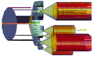
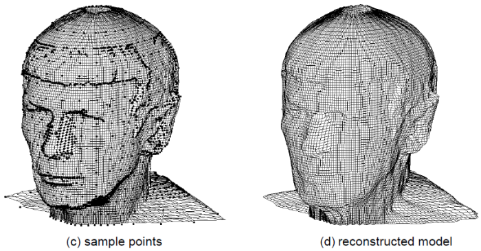
- M. Alexa, J. Behr, D. Cohen-Or, S. Fleishman, D. Levin and C.T. Silva, “Computing and Rendering Point Set Surfaces,” IEEE Trans. Visualization and Computer Graphics, vol. 9, no. 1, pp. 3-15,Jan.-Mar. 2003.

- J.T. Klosowski, M. Held, J.S.B. Mitchell, H. Sowizral and K. Zikan, “Efficient Collision Detection Using Bounding Volume Hierarchies of k-DOPs,” IEEE Trans. Visualization and Computer Graphics, vol. 4, no. 1, pp. 21-36,Jan.-Mar. 1998.
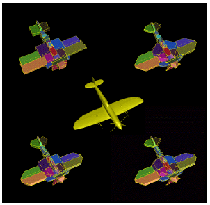
- J. Rossignac, “Edgebreaker: Connectivity Compression for Triangle Meshes,” IEEE Trans. Visualization and Computer Graphics, vol. 5, no. 1, pp. 47-61,Jan.-Mar. 1999. GVU Tech Report.
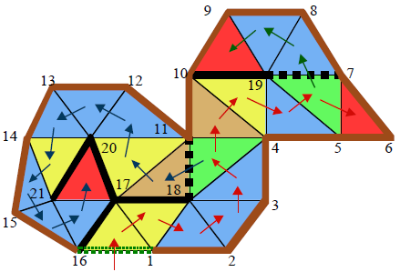
- D.A. Keim, “Information Visualization and Visual Data Mining,” IEEE Trans. Visualization and Computer Graphics, vol. 7, no. 1, pp. 1-8,Jan.-Mar. 2002.
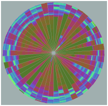
- N. Max, “Optical Models for Direct Volume Rendering,” IEEE Trans. Visualization and Computer Graphics, vol. 1, no. 2, pp. 99-108,June 1995.
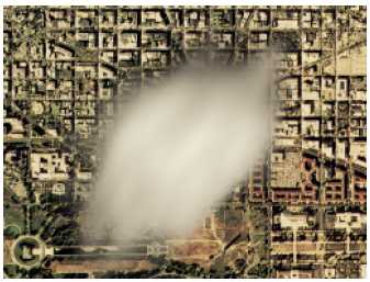
- P.M. Hubbard, “Collision Detection for Interactive Graphics Applications,” IEEE Trans. Visualization and Computer Graphics, vol. 1, no. 3, pp. 218-230,Sept. 1995.

- S. Lee, G. Wolberg, and S.Y. Shin, “Scattered Data Interpolation with Multilevel B-Splines,” IEEE Trans. Visualization and Computer Graphics, vol. 3, no. 3, pp. 228-244,July-Sept. 1997.
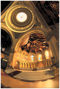
- G.W. Larson, H. Rushmeier, and C. Piatko, “A Visibility Matching Tone Reproduction Operator for High Dynamic Range Scenes,” IEEE Trans. Visualization and Computer Graphics, vol. 3, no. 4, pp. 291-306,Oct.-Dec. 1997.
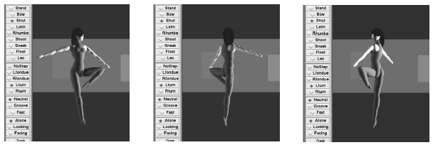
- K. Perlin, “Real Time Responsive Animation with Personality,” IEEE Trans. Visualization and Computer Graphics, vol. 1, no. 1, pp. 5-15,Mar. 1995.
Please feel free to add any other TVCG papers that have influenced your work significantly. Congrats TVCG and all the people involved with it!
