Archive for May 2009
Visualization tools and their use
In the past, I have discussed visualization tools and a few companies that make them. They are used by a wide variety of professionals such as the Business Intelligence community, Scientific Data explorers, Financial data analysts and many more users.
I feel though that more often than not such tools are an afterthought in a company’s think tank and require a significant amount of training, learning and overcoming a mental block by the senior management of a company. Companies such as Tableau Software, Spotfire, and many others must have excellent sales teams which, on identifying companies that may be able to benefit from their really stellar software, have to then pitch it to them. Even if the software blows the company management away, the reluctance on their part in adopting it surely must be a problem. Additionally, I am sure that even if the top management think its a great idea, the real users (lower level management/marketing/sales professionals) might not have the time and willingness to invest into using the software.
I know that the people behind these visualization companies are brilliant researchers who are not only innovating in the field of visualization but also taking the extra effort to improve on proven visualization techniques in order to make them easy to use.
I feel very strongly about this matter and wonder if a few things can be done to avoid this situation in the future. Clearly, just as training radiologists and other medical software users to use 3D volume rendering software is an uphill task, training business analysts to use visualization tools must be a difficult task.
1 – Provide an educational version of the software that can be available and used only through academic institutions. They could be fully featured or have only some evaluation features but let your software be one of the first tools that students use when analyzing their data. That will ensure that at least a few of them will be trained in using the tool when they go on to join a company and root for your visualization software at the company. If you think about it, companies like Microsoft allow free downloads of their express edition of Visual Studio for students which ensures a familiarity with the software that developers then take to companies when they join there. In my experience, students are far more ready to learn new software and technologies as compared to senior management in a company. They also have more time on their hands and can devote more time to learn the spiffy new features in your visualization software.
2 – Developing a course or two for data analysis in conjunction with a professor at a university – Merely providing educational versions of the software is of limited value. An interesting data analysis course that teaches use of your software or two/three other similar software tools along with basics of data analysis and an overview of visualization techniques might be another interesting way to approach the problem.
3 – Provide easy to use learning material – Take the time and make sure to have tutorials and multitudes of examples on your website that will allow users to use them and improve over time. Having a free PDF book or a step-by-step tutorial can vastly benefit the user and take some load off of your hands for training purposes. Tableau software does an amazing job in the training realm as can be seen by the examples at http://www.tableausoftware.com/learning/examples. You can even download a ‘workbook’ for each example and play around with it in your copy of the software.
4 – Provide free training in the form of Webcasts – Recently, nvidia had a few webcasts focused on CUDA and its applicability for general purpose computing on the GPU. The webcast consisted of a few nvidia developers giving a presentation and answering some questions at the end. The webcast was free and was a great way to indoctrinate a few more researchers to use CUDA for which they would have to buy nvidia graphics cards. I thought it was a great idea which could be taken even further when applied to visualization software. If your users already have a running software, then publishing sample datasets and walking them through it can be even more compelling and interactive than reading an online tutorial or a book chapter.
5 – Providing training at a conference or a workshop might be another way to get users to download your evaluation version and play with some data. Google has been doing similar ‘training’ at conferences like SIGGRAPH and IEEE Visualization for the last couple of years now. This helps you get new users as well as allow for professionals attending the conference to learn something they might convey to their company when they go back to work, which could translate into acceptance and added sales for the company.
If you have any other suggestions, please feel free to let me know. Sorry there are no pretty visualizations in this post 🙂
Visualizing the economy and its effects
Other than the standard line/bar charts that you will see showing the state of the economy as measured by some index, here are some interesting ways in which the economy and its impact is being conveyed.
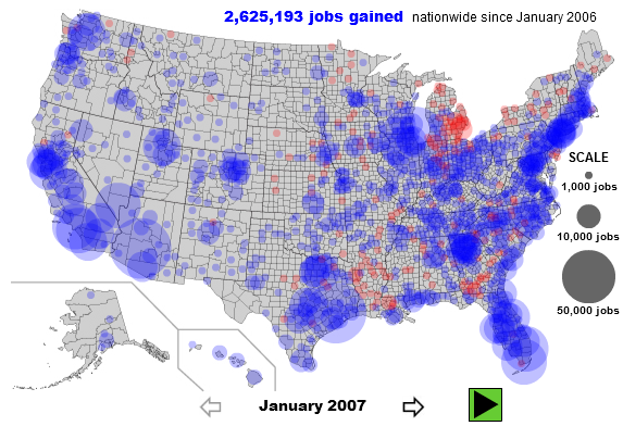
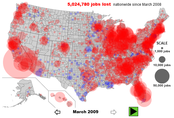
- TipStrategies.com have an amazing visualization of the jobs gained dropping around May 2007 and the job losses really picking up in late 2008. Click here to see the entire video progression http://tipstrategies.com/archive/geography-of-jobs/
- Interactive map of job’s per county on Slate.com. You can interact with the map at http://www.slate.com/id/2216238/. Here are two snapshots contrasting the situation from January 2007 with that in March 2009. The entire east coast, major cities in California, Washington, Oregon and the midwest seem to be most affected with job losses.
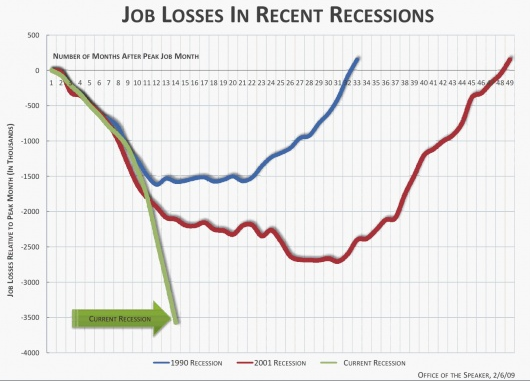
- Flowingdata as always has an excellent post on job losses. This snapshot compares the current recession with recessions in the past and job losses in that recession.
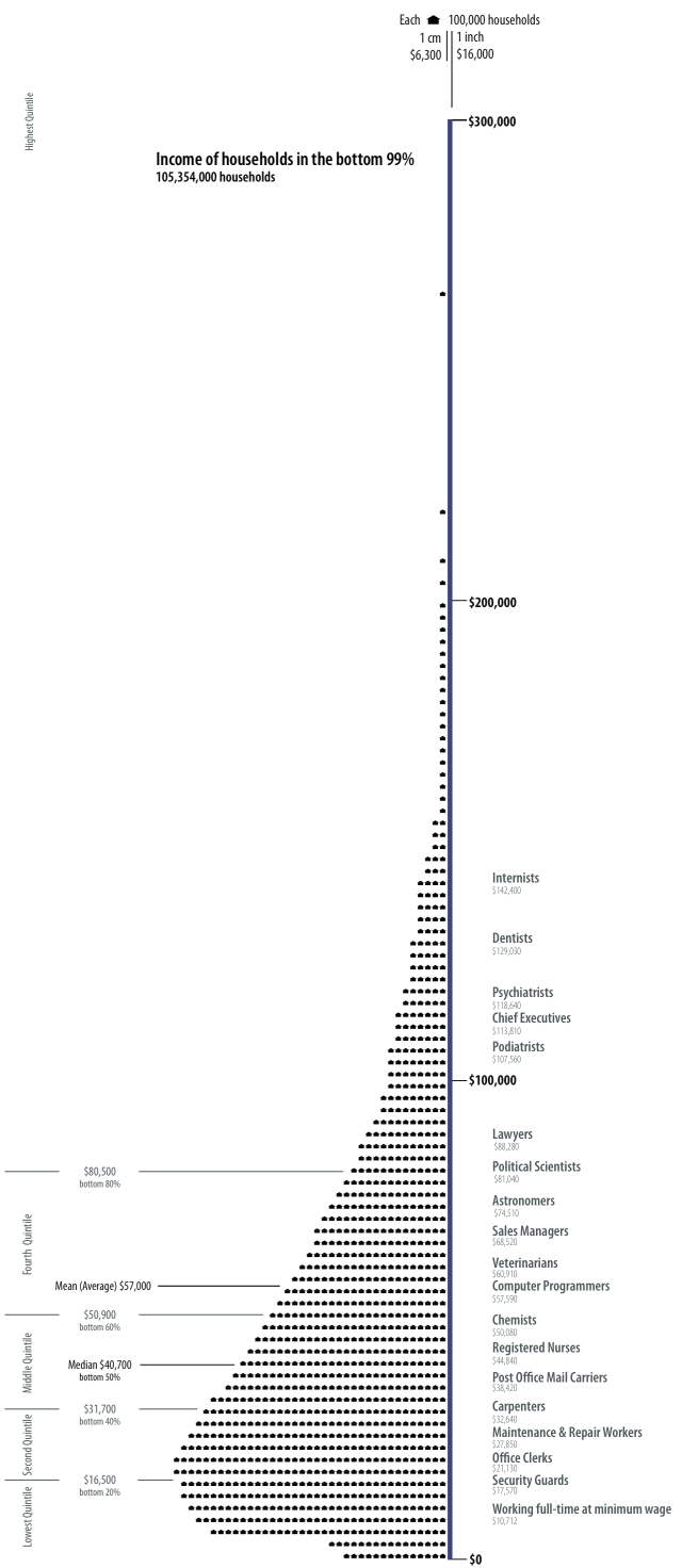
- There is actually a blog titled Visualizing Economics – http://www.visualizingeconomics.com/. One of my favorite posts on this blog is on the relationship between your occupation and the your income. You can download the original pdf or even buy the original poster at http://www.visualizingeconomics.com/posters. Apparently, podiatrists make just a little less than an average chief executive 🙂 . Here’s a snapshot
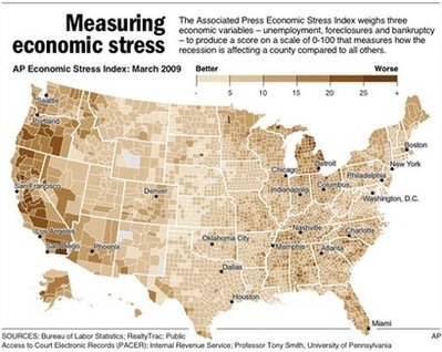
- The Associated Press had a news story where they created a ‘stress map’. The story can be found at http://news.yahoo.com/s/ap/20090518/ap_on_re_us/us_stress_map.You can clearly pinpoint certain regions, but mostly parts of the west coast seems to be affected the most as per their three economic variables – unemployment, foreclosures and bankruptcy. An interactive visualization can be found at http://hosted.ap.org/dynamic/files/specials/interactives/_national/stress_index/index.html?SITE=YAHOO&SECTION=HOME. Here’s a snapshot of the stress map
- FlowingData.com had yet another great post showing a visual representation of the seven deadly sins. Interestingly, Wall Street shows up pretty high on the ‘Greed’ visual representation whereas the Wrath can be seen most in the southern and south eastern parts. Looking at Slate’s job losses map above, one could say that job losses are loosely corrleated with anger and ‘wrath’ in certain regions. Las Vegas Sun ran a story on the study and the related visualizations which can be found at http://www.lasvegassun.com/news/2009/mar/26/one-nation-seven-sins/
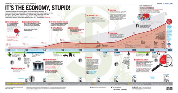
- GOOD Magazine – has an amazing infographic in a post on the economy. Here’s a lower resolution snapshot of the original. A higher resolution image can be found at http://awesome.goodmagazine.com/goodsheet/goodsheet006economy.html
- Investment companies are now making charts to help consumers and clients – Here’s a really nice infographic from Russell Investments
- Users at Many Eyes have been busy visualizing any data that they can get their hands on as regards to the economy
- Visualizing President Obama’s speech on the economy – http://manyeyes.alphaworks.ibm.com/manyeyes/visualizations/obamas-speech-on-economy-october-200
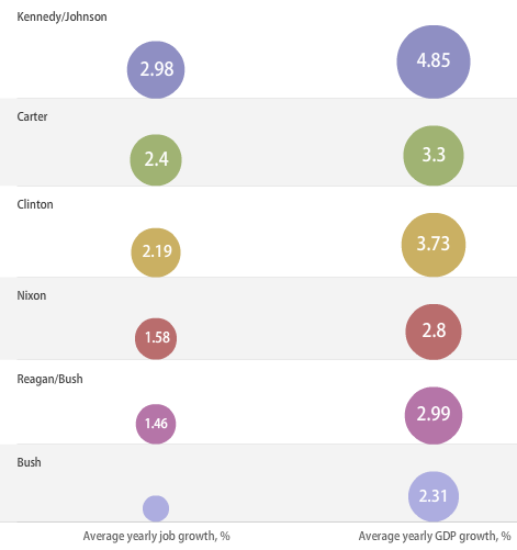
- Visualizing Economy and Presidential Administrations – Wonder what President Obama’s data will look like. Here’s a snapshot of the interactive visualization
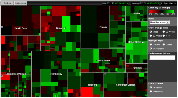
- For those still investing ;), there’s always SmartMoney’s Treemap-based visualization of the Market situation updated in realtime
- Static Visualization of the Dow Jones Industrial Average Index – http://www.mamk.net/?p=1644
- What do people think about the situation right now. Twitter feeds pertaining to the economy – http://spy.appspot.com/find/economy?latest=25
Have you seen any other innovative visualizations of the economy, its impact on the United States or the World or any other interesting interactive visualizations related to this topic?
Visualization in Sports
This article is not about “improving your ability in sports using visualization“. This post is focused on the ubiquity of computer graphics and visualization in sports. As a television viewer, player, coach or just a curious individual, you may have seen some of these visualizations for analyzing a game. It seems more common for coaches to use visual analytic tools to analyze the opposing teams in almost all sports now.
Visualizing American football (NFL)
- Professor Chris Healey from NCSU has an interesting project on visualizing NFL games. The project details can be found at http://www.csc.ncsu.edu/faculty/healey/NFL_viz/.Here is a screenshot of a small section of the visualization of the entire SuperBowl 2009 game between Arizona and Pittsburgh.

- The NYTimes vis lab has an interesting visualization titled – Rushing points per game – http://vizlab.nytimes.com/visualizations/rushing-points-per-game-nfl-teams-2
- On Many Eyes you can see that common users have generated visualizations of various aspects of football
- Visualizing Fantasy Football teams – This paper by Pearlman et al. discussed ways to visualize diversity in a fantasy team and is an interesting read. Jason Pearlman, Penny Rheingans, Marie des Jardins, “Visualizing Diversity and Depth over a Set of Objects,” IEEE Computer Graphics and Applications, vol. 27, no. 5, pp. 35-45, Sep./Oct. 2007, doi:10.1109/MCG.2007.139
- Ben Fry‘s post linking the intelligence of a football player with their position on the field. His post talks about how teams have started using Wonderlic test while scouting players and that their performance on that test becomes one of the factors that determines the position they play on the field. Its quite an interesting read supported ofcourse by visual representations. More at http://benfry.com/writing/archives/147
Visualizing Baseball (MLB)
- Ben Fry strikes(?) again!! His entertaining interactive ‘Salary vs Performance‘ sketch implemented in Processing provides interesting insights into whether the most expensive team is actually performing the best (or NOT as in the case of the New York Yankees :)) Visit http://benfry.com/salaryper/ to play with the sketch and find out how your favorite team is doing.

- A very interesting blogpost on ‘Visualizing Tim Wakefield’s knuckleball‘. A statisticians view on analyzing and visualizing baseball pitches and baseball data in general. Has some good links for baseball related data.
- Josh Kalk’s amazing tool that lets you create your own baseball graph by using a simple interface – http://baseball.bornbybits.com/php/combined_tool.php. For example, playing around with it I found that Alex Rodriguez hits most home runs on a fastball as compared to a slider or a splitter.
- Can parallel coordinates be far behind? Parallel coordinates for visualizing baseball statistics – http://www.matthewtavares.com/baseball_report/
- Wow! A Baseball visualization tool – Visual io is a visualization company that produces tools for allowing visual analysis of corporate data. They used to have a baseball visualization tool that has been taken down. It was really cool and more details can be found at http://simplecomplexity.net/2008/11/26/visual-ios-baseball-visualization-tool/
- An interesting article by Dan Fox called “Schrodinger’s Bat” on visualizing baseball pitches. Clearly the title is a play of words on Schrodingers Cat 🙂 Here’s a visualization of DiceK‘s three pitch types.

Visualizing Basketball (NBA & WNBA)
- Very interesting post on what combinations of players works best and what styles the teams play – Visualizing the WNBA’s top player combinations
- Links to an excellent article about NBA playing style spectrum.The spectrum of most of the famous basketball players can be found at http://gmapuploader.com/iframe/OcGKRzNj4B. Zoom in to explore it closely.
- David Ng’s final project on Professional Basketball Player Performance Trends from Hanspeter Pfister’s class at Harvard (http://www.seas.harvard.edu/courses/cs171/)
- ESPN’s Game Flow – Line graph to show the progression of the game
- A very amusing visualization correlating Return of Investment on their players. The idea is similar to Ben Fry’s ‘salary vs performance’ sketch, but the visualization here is completely different.
- An awesome visualization of all the shots from the NBA 2007-08 season. Check out their processing sketch at http://jasonrbailey.com/jason/courtvis/. Clearly, players prefer to hit three pointers from the corners than anywhere else.

- More visualization that look like treemaps from – Road to the NBA finals
- Another visualization showing something they call the Player Genome . They visualize each player’s stats as a color coded line. The entire visualization does look sort of like a genome 🙂
Visualizing Cricket
- -Infographics is widely used in telecasts – Bowling overview, batting overview (wagon wheel) to show which parts of a ground is a particular player hitting to in that innning. A snapshot of a wagon wheel (as it is called) is shown here (Image credits: cricinfo)
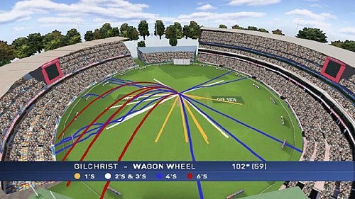
- The value of graphical presentation of data: An example from cricket – http://www.mansw.nsw.edu.au/members/reflections/vol23no4skinner.htm
Golf swing visualization
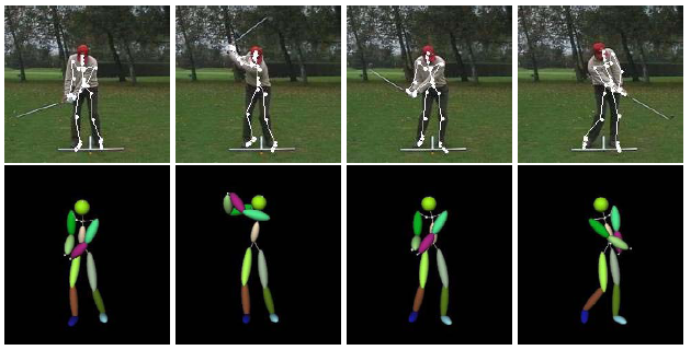
- Urtasun et al. published a paper for 3D tracing of the golf swing. Here is the citation and the link to the paper: Raquel Urtasun , David J. Fleet , Pascal Fua, Monocular 3-D Tracking of the Golf Swing , Proceedings of the 2005 IEEE Computer Society Conference on Computer Vision and Pattern Recognition (CVPR’05) – Volume 2, p.932-938, June 20-26, 2005. Here is a snapshot from their paper.
- Naturally, there would be a company selling a product for such sort of a thing. Flightscope, the company that tracks a tennis ball for debatable calls during a match, uses 3D Doppler tracking for tracking your golf swing –
I am sure you have seen visualization and infographics being widely used in your favorite sports. Please feel free to add a link or even mention it in the comments section.
