Archive for January 2010
Redesigned Visualizations
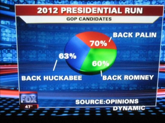
Lately, we have been seeing a high number of ‘bad’ visualizations in media. Over at Infosthetics, they even had a contest to identify the ‘Most Ugly and Useless Infographic‘. It was worth a few chuckles but it definitely made one realize the importance of effective data visualization. It is unfortunate that some people have to make decisions based on such visual representations.
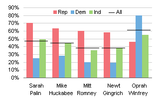
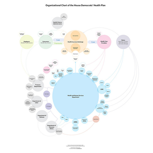
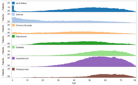
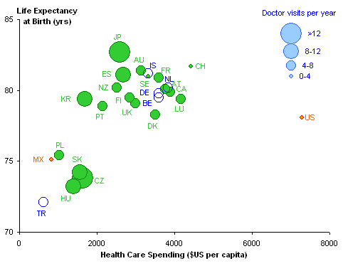
More than just looking at bad visual representations, there seems to be an increasingly constructive trend of redesigning graphs/visualizations that seem to get very popular in media. I wholeheartedly support this endeavor and hope to see more. It is naturally easy to criticize other visualizations, but redesigning it to ‘put your visualization where your mouth is’ takes courage. Here are a few examples.
If you have seen any other interesting visualization critiques, please send them my way and I shall be happy to update this post.
