Posts Tagged ‘visualization’
Visweek 2011 – Telling stories with data
Workshop: Telling Stories With Data
The Telling Stories With Data session was a continuation of last year’s session, largely inspired by the Edward Segel and Jeffrey Heer paper; “Narrative Visualization: Telling Stories with Data.”
Steve Drucker from Microsoft Research talked about his rich interactive narrative player work. The tool uses XML to set up a queue of keyframes with audio narration. It supports audio narration and multimedia embedding.
Wesley Willet talked about supporting ad-hoc storytelling in social media. He raised several technical issues, including the need for interactive visualization state encoding in URLs. This would allow people to link to a specific state in the visualization, and share that state over social media.
Jerome Cukier talked about adding personal connections to visualizations to help audience engagement. He also discussed the importance of providing interaction that lets users feel like they are exploring the dataset and coming to their own conclusions. A significant take- away quote Jerome had is “Trust is not really an exact science.”
Sunah Suh framed a discussion about the impact of culture on visualization and visualization on culture. She discussed the multiple forms of literacy beyond just natural language, addressing issues of statistical literacy as well as visual. She raised the point that visualization does not just reflect and rely on societal norms, it also reinforces them. One example she gave was the pink and blue color coding in Baby Name Voyager reinforcing a binary gender concept.
The takeaways from the first half of the session dealt with technical issues of platforms and tools to support narratives, as well as some of the social issues going on in narrative visualizations. Both of these are important issues as narrative visualization finds its place in culture. The necessary tools must be developed to help narrative visualization become ubiquitous, but also there are social issues to be addressed as people come to terms with the new media.
These notes were transcribed by Lane Harrison (@laneharrison) and Drew Skau(@seeingstructure). They are both graduate students at UNCC. Thanks guys!! There were other excellent speakers who presented, but Drew and Lane were presenting in an adjoining session.
Redesigned Visualizations
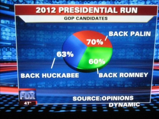
Lately, we have been seeing a high number of ‘bad’ visualizations in media. Over at Infosthetics, they even had a contest to identify the ‘Most Ugly and Useless Infographic‘. It was worth a few chuckles but it definitely made one realize the importance of effective data visualization. It is unfortunate that some people have to make decisions based on such visual representations.
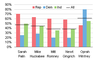
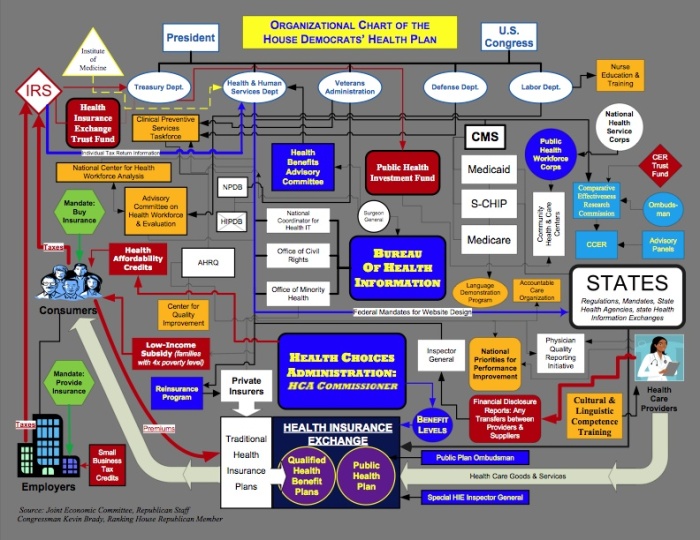
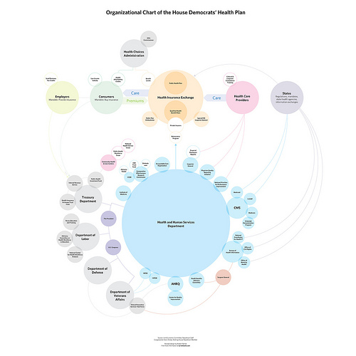
More than just looking at bad visual representations, there seems to be an increasingly constructive trend of redesigning graphs/visualizations that seem to get very popular in media. I wholeheartedly support this endeavor and hope to see more. It is naturally easy to criticize other visualizations, but redesigning it to ‘put your visualization where your mouth is’ takes courage. Here are a few examples.
If you have seen any other interesting visualization critiques, please send them my way and I shall be happy to update this post.
Ten most cited TVCG papers
The IEEE Transactions on Visualization and Computer Graphics journal completed 15 years this month and in the editorial, the 10 most cited papers in the last 15 years have been mentioned. Some of them are survey papers and some are classics. These papers have received between 550-250 citations in the past 15 years.
Here are the papers (in no particular order):
- I. Herman, G. Melançon, and M.S. Marshall, “Graph Visualization and Navigation in Information Visualization: A Survey,” IEEE Trans. Visualization and Computer Graphics, vol. 6, no. 1, pp. 24-43,Jan.-Mar. 2000.
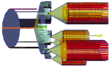
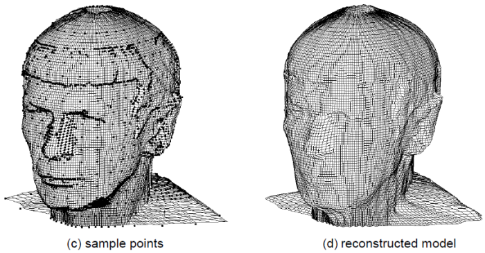
- M. Alexa, J. Behr, D. Cohen-Or, S. Fleishman, D. Levin and C.T. Silva, “Computing and Rendering Point Set Surfaces,” IEEE Trans. Visualization and Computer Graphics, vol. 9, no. 1, pp. 3-15,Jan.-Mar. 2003.

- J.T. Klosowski, M. Held, J.S.B. Mitchell, H. Sowizral and K. Zikan, “Efficient Collision Detection Using Bounding Volume Hierarchies of k-DOPs,” IEEE Trans. Visualization and Computer Graphics, vol. 4, no. 1, pp. 21-36,Jan.-Mar. 1998.
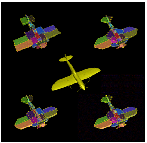
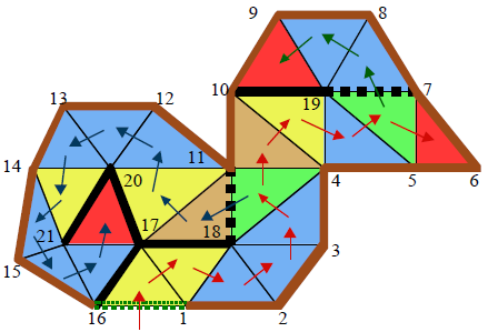
- J. Rossignac, “Edgebreaker: Connectivity Compression for Triangle Meshes,” IEEE Trans. Visualization and Computer Graphics, vol. 5, no. 1, pp. 47-61,Jan.-Mar. 1999. GVU Tech Report.
- D.A. Keim, “Information Visualization and Visual Data Mining,” IEEE Trans. Visualization and Computer Graphics, vol. 7, no. 1, pp. 1-8,Jan.-Mar. 2002.
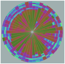
- N. Max, “Optical Models for Direct Volume Rendering,” IEEE Trans. Visualization and Computer Graphics, vol. 1, no. 2, pp. 99-108,June 1995.
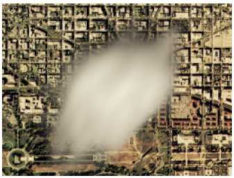
- P.M. Hubbard, “Collision Detection for Interactive Graphics Applications,” IEEE Trans. Visualization and Computer Graphics, vol. 1, no. 3, pp. 218-230,Sept. 1995.

- S. Lee, G. Wolberg, and S.Y. Shin, “Scattered Data Interpolation with Multilevel B-Splines,” IEEE Trans. Visualization and Computer Graphics, vol. 3, no. 3, pp. 228-244,July-Sept. 1997.
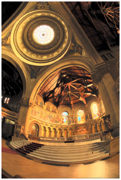
- G.W. Larson, H. Rushmeier, and C. Piatko, “A Visibility Matching Tone Reproduction Operator for High Dynamic Range Scenes,” IEEE Trans. Visualization and Computer Graphics, vol. 3, no. 4, pp. 291-306,Oct.-Dec. 1997.
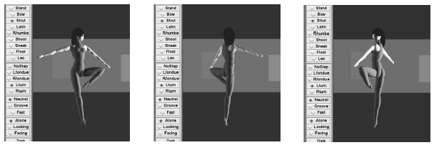
- K. Perlin, “Real Time Responsive Animation with Personality,” IEEE Trans. Visualization and Computer Graphics, vol. 1, no. 1, pp. 5-15,Mar. 1995.
Please feel free to add any other TVCG papers that have influenced your work significantly. Congrats TVCG and all the people involved with it!
Visualizing the economy and its effects
Other than the standard line/bar charts that you will see showing the state of the economy as measured by some index, here are some interesting ways in which the economy and its impact is being conveyed.
- TipStrategies.com have an amazing visualization of the jobs gained dropping around May 2007 and the job losses really picking up in late 2008. Click here to see the entire video progression http://tipstrategies.com/archive/geography-of-jobs/
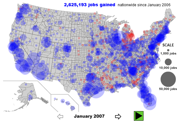
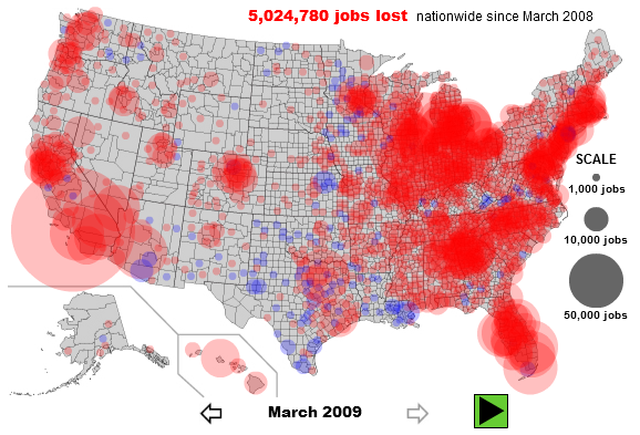
- Interactive map of job’s per county on Slate.com. You can interact with the map at http://www.slate.com/id/2216238/. Here are two snapshots contrasting the situation from January 2007 with that in March 2009. The entire east coast, major cities in California, Washington, Oregon and the midwest seem to be most affected with job losses.
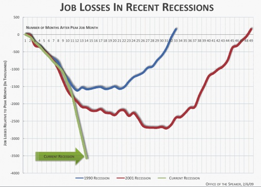
- Flowingdata as always has an excellent post on job losses. This snapshot compares the current recession with recessions in the past and job losses in that recession.
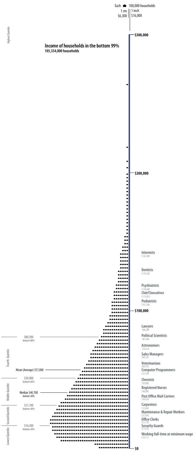
- There is actually a blog titled Visualizing Economics – http://www.visualizingeconomics.com/. One of my favorite posts on this blog is on the relationship between your occupation and the your income. You can download the original pdf or even buy the original poster at http://www.visualizingeconomics.com/posters. Apparently, podiatrists make just a little less than an average chief executive 🙂 . Here’s a snapshot
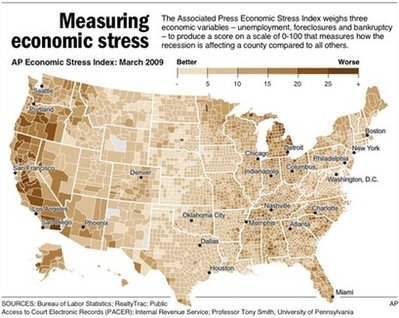
- The Associated Press had a news story where they created a ‘stress map’. The story can be found at http://news.yahoo.com/s/ap/20090518/ap_on_re_us/us_stress_map.You can clearly pinpoint certain regions, but mostly parts of the west coast seems to be affected the most as per their three economic variables – unemployment, foreclosures and bankruptcy. An interactive visualization can be found at http://hosted.ap.org/dynamic/files/specials/interactives/_national/stress_index/index.html?SITE=YAHOO&SECTION=HOME. Here’s a snapshot of the stress map
- FlowingData.com had yet another great post showing a visual representation of the seven deadly sins. Interestingly, Wall Street shows up pretty high on the ‘Greed’ visual representation whereas the Wrath can be seen most in the southern and south eastern parts. Looking at Slate’s job losses map above, one could say that job losses are loosely corrleated with anger and ‘wrath’ in certain regions. Las Vegas Sun ran a story on the study and the related visualizations which can be found at http://www.lasvegassun.com/news/2009/mar/26/one-nation-seven-sins/
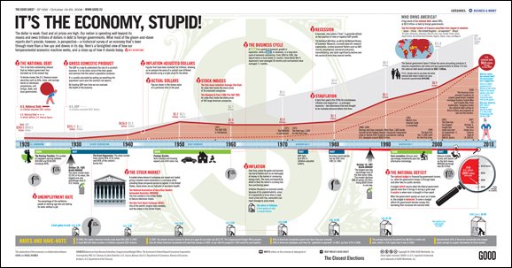
- GOOD Magazine – has an amazing infographic in a post on the economy. Here’s a lower resolution snapshot of the original. A higher resolution image can be found at http://awesome.goodmagazine.com/goodsheet/goodsheet006economy.html
- Investment companies are now making charts to help consumers and clients – Here’s a really nice infographic from Russell Investments
- Users at Many Eyes have been busy visualizing any data that they can get their hands on as regards to the economy
- Visualizing President Obama’s speech on the economy – http://manyeyes.alphaworks.ibm.com/manyeyes/visualizations/obamas-speech-on-economy-october-200
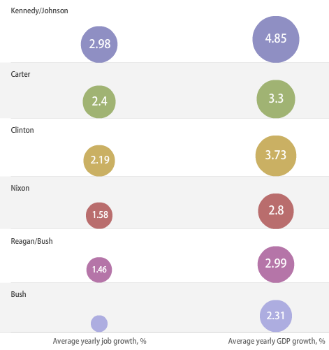
- Visualizing Economy and Presidential Administrations – Wonder what President Obama’s data will look like. Here’s a snapshot of the interactive visualization
- For those still investing ;), there’s always SmartMoney’s Treemap-based visualization of the Market situation updated in realtime
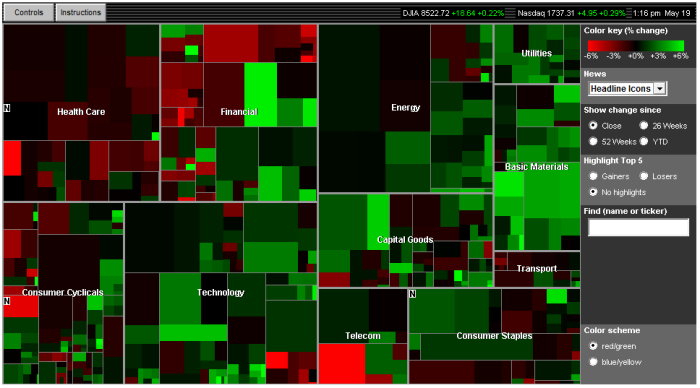
- Static Visualization of the Dow Jones Industrial Average Index – http://www.mamk.net/?p=1644
- What do people think about the situation right now. Twitter feeds pertaining to the economy – http://spy.appspot.com/find/economy?latest=25
Have you seen any other innovative visualizations of the economy, its impact on the United States or the World or any other interesting interactive visualizations related to this topic?
IEEE Visualization 2008 papers review
Here’s a really late review of some of my favorite papers from the IEEE Visualization 2008 conference.

IEEE Visualization Conference
Size-based Transfer Functions: A New Volume Exploration Technique – Carlos D. Correa, Kwan-Liu Ma
The idea is to automatically color various features of a dataset based on the local scale of the features. Reading their paper and looking at their amazing images make their techniques seem deceptively easy. You have to only see some of Carlos’ previous work to realize that his visualizations are always impressive and his papers easy to read.
Direct Volume Editing – Kai Bürger, Jens Krüger, Rüdiger Westermann
This paper introduces interactive volume editing. The idea is to allow a user control over the visual appearance of a volume, much like an image editor allows you to edit an image. Here they allow for interactive editing of the volume which includes annotation, coloring and much more. Some of their results are just amazing and could easily pass off as hand-drawn illustrations.
VisComplete: Automating Suggestions for Visualization Pipelines – David Koop, Carlos E. Scheidegger, Steven P. Callahan, Juliana Freire, Cláudio T. Silva
This paper is from a long series of papers that showcase the strength of provenance. VisTrails was first introduced at the IEEE Visualization 2005 conference with a demo given by Carlos Scheidegger at the VTK Birds-of-a-Feather session. Since then, not only has it blossomed into a complete and extremely useful product (and spawned a company, VisTrails Inc.). They have published some award winning papers like the IEEE Visualization 2007 Best Paper VisComplete: “Querying and Creating Visualizations by Analogy.” Additionally, many products (Paraview, Maya) are taking note of the power of provenance and working with VisTrails Inc. to incorporate it into their workflow. You can find more information about provenance and VisTrails at http://www.vistrails.org/index.php/Publications_and_Presentations.
Color Design for Illustrative Visualization
Lujin Wang, Joachim Giesen, Kevin T. McDonnell, Peter Zolliker, Klaus Mueller
This was a particularly interesting paper since it presented an interesting approach to picking colors for illustrative visualization. I have posted previously on Illustrative visualization and think that it is an exciting field and has many challenges that include perception, cognition and abstraction. It is not merely a stylistic issue but a representational issue where what is shown to the viewer has to be carefully identified and more importantly what is not shown has to be conveyed to the viewer using context or visual cues to convey to the viewer that there is more data that is being abstracted out. Anyway, I enjoyed this paper in particular and look forward to some more papers this year.
Effects of Video Placement and Spatial Context Presentation on Path Reconstruction Tasks with Contextualized Videos
Yi Wang, Doug Bowman, David Krum, Enylton Coelho, Tonya Smith-Jackson, David Bailey, Sarah Peck, Swethan Anand, Trevor Kennedy, Yernar Abdrazakov
In this paper, the authors presented a system that provides context during virtual navigation using correctly placed videos. An interesting finding in the paper was that participants in their user study were able to perform tasks in unfamiliar environments using only virtual navigation as compared to participants who were navigating in familiar virtual environments. Such work can have a considerable impact on video surveillance systems.
Interactive Visual Steering – Rapid Visual Prototyping of a Common Rail Injection System
Krešimir Matković, Denis Gračanin, Mario Jelović, Helwig Hauser
This was a particularly well presented case study where visualization was used for interactive steering in a real world scenario. The authors were candid enough to discuss their design choices and I think we need many more such papers where the process of refinement and discussion is presented to help readers see the iterations instead of a nice finished final product that does everything the collaborators wanted. It was interesting to see the use of multiple coordinated views and parallel coordinates and to read their experiences with using it.
Text Scaffolds for Effective Surface Labeling
Gregory Cipriano, Michael Gleicher
I enjoyed reading this paper and secretly wished that I had developed such a nice way to label data. The paper discusses a technique to label surface data that follows the contours of the surface in a manner similar to what illustrators do when they label illustrations. The images presented in the paper were great and some of the work coming from their group has been particularly interesting. I would also like to draw your attention to their paper from last year’s Vis conference -“Molecular Surface Abstraction“.
Were there any specific papers you liked that I may have missed? Please feel free to comment.
Visualization in politics
As the November elections approach, I’ve been observing more and more websites, newspapers and even a few researchers conveying data and trends using visualization techniques.
Fivethirtyeight.com is a website which claims to correctly project election results and one that is getting a lot of media coverage [and on the Colbert report] has a few examples of visualizations.
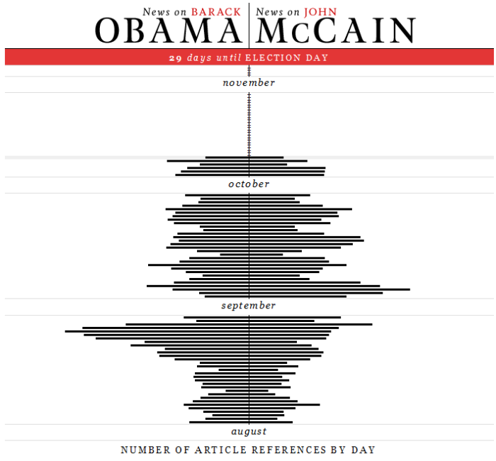
EveryMomentnow.com is a wonderful website that tracks the number of news articles that are focused on one of the presidential candidates. Here is an example visualization from their main page. It reminded me of Tufte’s Sparklines, which convey information so succinctly.
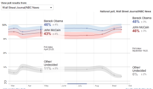
But, New York Times scores a home-run again by making an interactive election visualization that allows readers to explore their data, create your own prediction map and much much more. It even allows you pick different ‘opinion polls’ and see what they’re predicting. Here’s a snapshot from the ‘Wall Street Journal/NBC News’ predictions. It can be found at http://elections.nytimes.com/2008/president/whos-ahead/key-states/map.html
CNN.com has its own version of visualizations for polling and electoral map calculator.
Microsoft’s Live Labs too has developed “Political Streams” which is basically an integrated visualization tool of sorts, that allows one to visualize the attention an event is getting. They divide the ‘attention’ into ‘news’ attention and ‘blog’ attention. It would be more interesting if they would allow users to start their own streams.
Well, I’m happy to see that there has been some significant interest in the academic community as well.
Geoff Draper from the University of Utah will be presenting a paper in the IEEE Information Visualization 2008 conference (which is part of IEEE VisWeek 2008) titled: “Who Votes For What? A Visual Query Language for Opinion Data” by Geoffrey M. Draper & Richard F. Riesenfeld.
Visualization researchers such as Chris Healey from NCSU and Jean Daniel Fekete from INRIA have worked on visualizing election results in the past.
Chris Healey’s 2004 US Presidential Election research: http://www.csc.ncsu.edu/faculty/healey/US_election/
Jean Daniel Fekete’s 2004 French Election related work: http://www.lri.fr/~fekete/elections2004/index.en.html
As always, my favorite visualization website, Many Eyes, is full of users trying to visualize everything from
– Palin’s Comments During the VP Debate
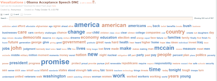
– Obama’s Nomination Acceptance Speech at the DNC
Many more such elections related visualization have been created and can be browsed at http://services.alphaworks.ibm.com/manyeyes/browse/visualizations?q=presidential
I feel that even though some visualizations provide interactivity, most of them seem to stay away from using some of the wonderful information visualization research that has been going on to allow users to obtain insight such as the ‘Visual Information Exploration for the Web‘ by Sheelagh Carpendale. I’m sure you have seen some good and bad visualizations this election season. Please feel free to post links or mention them in the comments.

