Archive for the ‘ieee visualization’ Category
Visweek 2011 – Perception and Cognition for Visualization, Visual Data Analysis & Computer Graphics
I had mentioned in an earlier post that this tutorial promises to be an amazing one and so it was. Here is an outline of the workshop.
Bernice E. Rogowitz covered fundamentals in human perception and cognition, and discussed how they apply to visualization. She covered a huge array of topics, ranging from the pupil being partially responsible for our depth perception, all the way to color theory and how it relates directly to the biology of the human eye.
The presentation had a great flow, starting at a very high level to give everyone an idea of what questions they would be able to answer at the end. As the talk progressed, she covered detailed biological details of the human eye, and progressed to the intersection of perceptual issues and computer science.
In the biological portion, we learned that there are five layers of cells in the retina, each responsible for different tasks. Much of the interesting stuff happens at the very beginning (photoreceptor distribution) and then further into the process at the ganglion cells. She went over how lateral inhibition is caused by the spatial distribution of the photoreceptors connected to a single ganglion cell, and how this is the reason for several of the optical illusions we perceive. She did a great job of explaining the connections between biology and perceptual issues.
Cultural differences were also addressed. The eye movements we have are actually learned when we learn how to read. Cultures with different reading directions have substantially different reading directions.
The section on the Striate Cortex was especially interesting. This is the first time in the visual system that images from each eye are merged (the point where depth perception occurs). This section sends output to 60% of the brain! This is a huge amount, and makes the visual system incredibly important to the decision making process.
This tutorial had a huge quantity of useful information and was really well put together! She concluded with a great summary of four things to remember:
- There are different response rates for different stimuli, how well do you want to convey magnitude information?
- Color and luminance mechanisms have different spatial sensitivities.
- Certain visual information is perceived “pre-attentively” such as color.
- How the world is perceived depends on what the user is trying to accomplish.
Visweek 2011 – VAST Challenge
The IEEE VAST Challenge this year consisted of three mini challenges and one “grand challenge”. For the uninitiated, the challenge datasets are designed to reflect real-world analytical challenges. This year’s challenges involved microblog+geospatial data, cyber security data, and a corpus of plain-text news documents.
While there is no “winner”, the challenge entries are given awards based on their respective strengths. Participants are also given detailed feedback from both visualization experts and actual analysts who work with such data. This feedback is one of the most rewarding aspects of the VAST Challenge. As we all know, it’s hard to get access to analysts.
One highlight is a geo-text visualization approach from the Universität Stuttgart. ContentLens is a novel integration of tag-cloud methods and geo-visualization and interaction techniques. Perhaps if you ask nicely, they’ll give another demo.
Another interesting approach come from Penn State, who leverage their GeoViz toolkit to analyze a large (10gb+) set of cyber security data. In fact, the security data took center stage in a panel of security and/or visualization practitioners.
Some key points in the panel suggested a need for smart collaboration in large-scale security analysis. Analysts can often unnecessarily repeat work or miss threats that has already been addressed by other analysts in their organization. Maybe we need an “Amazon- Recommendations” component for security analysis tools.
Finally, workshop participants heard about and discussed the possible future VAST Challenges. Can visual analytics handle a million-node network? Can this community design tools that enable consumers to make discoveries in the vast sea of data that surrounds them? Well, that’s up to you.
Link to detailed challenge descriptions: http://hcil.cs.umd.edu/localphp/hcil/vast11/index.php/taskdesc/index .
These notes were transcribed by Lane Harrison (@laneharrison) and Drew Skau (@seeingstructure). They are both graduate students at UNCC. Thank you guys!!
Visweek 2011 – Telling stories with data
Workshop: Telling Stories With Data
The Telling Stories With Data session was a continuation of last year’s session, largely inspired by the Edward Segel and Jeffrey Heer paper; “Narrative Visualization: Telling Stories with Data.”
Steve Drucker from Microsoft Research talked about his rich interactive narrative player work. The tool uses XML to set up a queue of keyframes with audio narration. It supports audio narration and multimedia embedding.
Wesley Willet talked about supporting ad-hoc storytelling in social media. He raised several technical issues, including the need for interactive visualization state encoding in URLs. This would allow people to link to a specific state in the visualization, and share that state over social media.
Jerome Cukier talked about adding personal connections to visualizations to help audience engagement. He also discussed the importance of providing interaction that lets users feel like they are exploring the dataset and coming to their own conclusions. A significant take- away quote Jerome had is “Trust is not really an exact science.”
Sunah Suh framed a discussion about the impact of culture on visualization and visualization on culture. She discussed the multiple forms of literacy beyond just natural language, addressing issues of statistical literacy as well as visual. She raised the point that visualization does not just reflect and rely on societal norms, it also reinforces them. One example she gave was the pink and blue color coding in Baby Name Voyager reinforcing a binary gender concept.
The takeaways from the first half of the session dealt with technical issues of platforms and tools to support narratives, as well as some of the social issues going on in narrative visualizations. Both of these are important issues as narrative visualization finds its place in culture. The necessary tools must be developed to help narrative visualization become ubiquitous, but also there are social issues to be addressed as people come to terms with the new media.
These notes were transcribed by Lane Harrison (@laneharrison) and Drew Skau(@seeingstructure). They are both graduate students at UNCC. Thanks guys!! There were other excellent speakers who presented, but Drew and Lane were presenting in an adjoining session.
Visweek 2011 is upon us!
The annual IEEE Visualization, IEEE Information Visualization and IEEE Visual Analytics Science and Technology conferences – together known as IEEE Visweek will be held in Providence, RI from October 23rd to October 28th.The detailed conference program is spectacular and can be downloaded here.Some of the new events this year are under the Professional’s Compasscategory. It includes a Blind date lunch (where one can meet some researcher they have never met and learn about each others research), Meet the Editors (where one can meet editors from the top graphics and visualization journals), Lunch with the Leaders session (an opportunity to meet famous researchers in the field) and Meet the faculty/postdoc candidates (especially geared towards individuals looking for a postdoctoral position or a faculty position). I think this is an excellent idea and hope that the event is a hit at the conference.I am also eagerly looking forward towards the two collocated symposia – IEEE Biological Data Visualization (popularly known as biovis) and IEEE LDAV (Large data analysis and visualization). Their excellent programs are out and I’d encourage you to take a look at them.
The tutorials this year look great and I am particularly looking forward to the tutorial on Perception and Cognition for Visualization, Visual Data Analysis and Computer Graphics by Bernice Rogowitz. Here is an outline for the tutorial that can be found on her website. She was one of the first people to recommend that people STOP using the rainbow color map.
The telling stories with data workshop too looks great and will be a continuation of the great tutorial held by the same group last year. I am eagerly looking forward to it.
Apart from this are the excellent papers that will be presented at the conference. I shall write another post about the ones I am particularly looking forward to. With so many exciting events going on, it almost seems like a crime to have all of them happening in the span of a few days.
I shall definitely be blogging about the event as much as I can. You can also follow me on twitter, which will have more real time tweets than the blog which will distil a days worth of information into a post.
Let me know if you are going to be around and I’ll be happy to talk to you.
Things to look out for at InfoVis 2009

InfoVis (Information Visualization) 2009 is an integral part of the Annual VisWeek conference. This year the VisWeek conference will be held in Atlantic city, NJ from October 11th-16th. In the next few posts, I shall post my views on things to look out for in each of the tracks at the VisWeek conference: VAST, Vis and Infovis. Here are some exciting talks/panels/workshops/tutorials that I’m looking forward to at InfoVis this year (Links and other material shall be updated as material becomes available):
Workshops:
Collaborative Visualization on Interactive Surfaces (CoVIS)
Organizers: Petra Isenberg, Michael Sedlmair, Dominikus Baur,
Tobias Isenberg, Andreas Butz
Tutorials:
Visualization and Analysis Using VisIt
Organizer: Hank Childs
Exploring Design Decisions for Effective Information Visualization
Organizers: Jo Wood, Jason Dykes, Aidan Slingsby
Keynote: Visual Thinking and Visual Thinking Tools
Speaker: Colin Ware, Data Visualization Research Lab, University of New Hampshire
Panels:
Changing the World with Visualization
Organizer: Robert Kosara
Panelists: Sarah Cohen, Jerome Cukier, Martin Wattenberg
Papers:
InfoVis Best Paper Award
ABySS-Explorer: Visualizing Genome Sequence Assemblies
Cydney B. Nielsen, Shaun D. Jackman, Inanç Birol, Steven J.M. Jones
InfoVis Best Paper Award
Mapping Text with Phrase Nets
Frank van Ham, Martin Wattenberg, Fernanda B. Viégas
InfoVis Honorable Mention
MizBee: A Multiscale Synteny Browser
Miriah Meyer, Tamara Munzner, Hanspeter Pfister
InfoVis Honorable Mention
Configuring Hierarchical Layouts to Address Research Questions
Aidan Slingsby, Jason Dykes, Jo Wood
InfoVis Honorable Mention
SellTrend: Inter-Attribute Visual Analysis of Temporal Transaction
Data, Zhicheng Liu, John Stasko, Timothy Sullivan
Spatiotemporal Analysis of Sensor Logs using Growth Ring Maps
Peter Bak, Florian Mansmann, Halldor Janetzko, Daniel A. Keim
A Nested Model for Visualization Design and Validation
Tamara Munzner
“Search, Show Context, Expand on Demand”: Supporting Large Graph Exploration with Degree-of-Interest
Frank van Ham, Adam Perer
A Comparison of User-Generated and Automatic Graph Layouts,
Tim Dwyer, Bongshin Lee, Danyel Fisher, Kori Inkpen Quinn, Petra Isenberg, George Robertson, Chris North
Visualizing Social Photos on a Hasse Diagram for Eliciting
Relations and Indexing New Photos, Michel Crampes, Jeremy de Oliveira-Kumar, Sylvie Ranwez, Jean Villerd
Bubble Sets: Revealing Set Relations with Isocontours over Existing Visualizations
Christopher Collins, Gerald Penn, Sheelagh Carpendale
Temporal Summaries: Supporting Temporal Categorical Searching, Aggregation and Comparison
Taowei David Wang, Catherine Plaisant, Ben Shneiderman, Neil Spring, David Roseman, Greg Marchand, Vikramjit Mukherjee, Mark Smith
Lark: Coordinating Co-located Collaboration with Information Visualization – YouTube Video – Paper link
Matthew Tobiasz, Petra Isenberg, Sheelagh Carpendale
Harnessing the Web Information Ecosystem with Wiki-based Visualization Dashboards
Matt McKeon
SpicyNodes: Radial Layout Authoring for the General Public
Michael Douma, Grzegorz Ligierko, Ovidiu Ancuta, Pavel Gritsai, Sean Liu
code swarm: A Design Study in Organic Software Visualization
Michael Ogawa, Kwan-Liu Ma
Protovis: A Graphical Toolkit for Visualization
Michael Bostock, Jeffrey Heer
Participatory Visualization with Wordle
Fernanda B. Viégas, Martin Wattenberg, Jonathan Feinberg
Capstone: Visual aids: Use of Paintings and Photography for Lighting in the Theater
Speaker: Brian MacDevitt, Broadway Lighting Designer
Things to look out for at VAST ’09
VAST is the Visual Analytics track at the Annual VisWeek conference. This year the VisWeek conference will be held in Atlantic city, NJ from October 11th-16th. In the next few posts, I shall post my views on things to look out for in each of the tracks at the VisWeek conference: VAST, Vis and Infovis. Here are some exciting talks/panels/sessions that I’m looking forward to this year (Links and other material shall be updated as soon as the papers are available):
Interactive Visual Clustering of Large Collections of Trajectories,
Gennady Andrienko, Natalia Andrienko, Salvatore Rinzivillo, Mirco Nanni, Dino Pedreschi, Fosca Giannotti
A Framework for Uncertainty-Aware Visual Analytics
Carlos D. Correa, Yu-Hsuan Chan, Kwan-Liu Ma
Parallel Tag Clouds to Explore and Analyze Faceted Text Corpora (YouTube Video)
Christopher Collins, Fernanda B. Viégas, Martin Wattenberg
Describing Story Evolution from Dynamic Information Streams
Stuart Rose, Scott Butner, Wendy Cowley, Michelle Gregory, Julia Walker
Evaluating Visual Analytics Systems for Investigative Analysis: Deriving Design Principles from a Case Study
Youn-ah Kang, Carsten Görg, John Stasko
Visual Analysis of Graphs with Multiple Connected Components
Tatiana von Landesberger, Melanie Görner, Tobias Schreck
VAST Best Paper Award: Iterative Integration of Visual Insights during Patent Search and Analysis
Steffen Koch, Harald Bosch, Mark Giereth, Thomas Ertl
FinVis: Applied Visual Analytics for Personal Financial Planning
Stephen Rudolph, Anya Savikhin, David S. Ebert
Visual Opinion Analysis of Customer Feedback Data
Daniela Oelke, Ming Hao, Christian Rohrdantz, Daniel A. Keim, Umeshwar Dayal, Lars-Erik Haug, Halldór Janetzko
VAST Capstone Panel
How Interactive Visualization Can Assist Investigative Analysis: Views and Perspectives from Domain Experts
Organizer: John Stasko
Panelists: Sarah Cohen, Lawrence Hunter, Joe Parry
Are you planning to come by to the VisWeek conference? Is so, which sessions are you interested in?
Visualizing the Swine Flu pandemic
Given the recent news about the outbreak of Swine Flu in many parts of the world, it has been interesting to see what kind of visual representations do newspapers, websites and print media use to convey the spread of the flu.
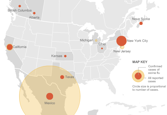
The NYTimes has some very insightful visualizations that provide information regarding the swine flu outbreak in America as well as the world.
America – http://www.nytimes.com/interactive/2009/04/26/us/20090427-flu-graphic.html
World (Updated daily – snapshot shown below)- http://www.nytimes.com/interactive/2009/04/27/us/20090427-flu-update-graphic.html
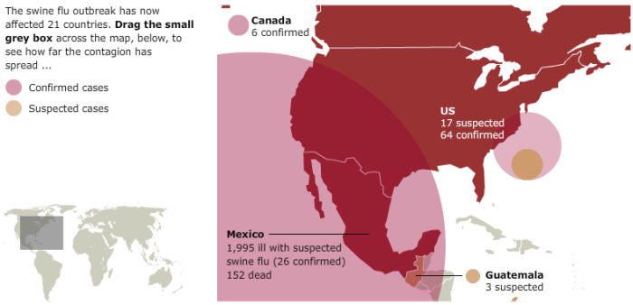
I thought the British Newspaper Guardian did a great job of providing and visualizing the data worldwide. It would have been a bit more interesting if they would have been able to show the entire globe effectively instead of providing the interactive widget, which is a bit limited I think. The link provides an updated visualization, a snapshot of which is shown below
http://www.guardian.co.uk/world/interactive/2009/apr/28/swine-flu-outbreak-mexico-pandemic
Paul Kedrosky’s blog has an interesting mashup of visualizing the flu in Mexico that used Google Trends to visualize the outbreak in parts of Mexico. http://paul.kedrosky.com/archives/2009/04/visualizing_swi.html
You can see what people are twittering about Swine Flu in real time at http://spy.appspot.com/find/swine%20flu%20epidemic?latest=25
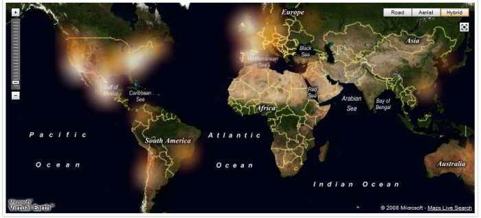
Heatmaps are a widely used visualization technique that is slowly being used widely to convey information. Danyel Fisher from Microsoft Research had discussed their use for drawing a viewer’s attention to a region of interest in his IEEE paper – “Hotmap: Looking at Geographic Attention“, IEEE Computer Society, Nov. 2007 .
The H1N1 Swine Flu Map as shown on UMapper uses Heatmaps to visualize the spread of Swine Flu. A snapshot is shown below, whereas an updated version can be found at http://www.umapper.com/maps/view/id/30340/
Ryan Goodman’s blog has a Google Map’s based visualization of America with information regarding the Flu outbreak in various parts of the country. http://ryangoodman.net/blog/index.php/c14/
HealthMap.org has a comprehensive visual representation of swine flu cases recorded so far – http://www.healthmap.org/en
I wonder if these are still the best ways to visualize the data out there. There is some data on Guardian’s website at http://www.guardian.co.uk/data-store. There is constantly updated data at the World Health Organization’s (WHO) website: http://www.who.int/csr/don/en/ as well as information regarding America at the CDC’s website at http://www.cdc.gov/swineflu/
Have you seen any interesting visualizations that convey the spread better?
IEEE Vis 2008 Keynote – Margaret Livingstone
What Art Can Tell Us About the Brain
Margaret S. Livingstone, Professor of Neurobiology, Harvard Medical School
I knew the keynote talk at the IEEE Visualization conference was going to be interesting when the student volunteer at the door handed me stereo glasses before the talk. The talk was focused on introducing concepts about color and luminance that artists have been using effectively for hundreds of years.
In the first part of the talk, she focused on introducing concepts such as centre-surround.
Some of the highlights from her talk are as follows:
– In some cases, color contrast is not equal to luminance contrast.
– People are good at recognizing objects from different points of view. This might be interesting since there seems to be considerable amount of work in graphics and visualization on finding the ‘best’ view for a particular dataset.
– Equiluminance – In the paper “Vernier and Displacement Thresholds in Equiluminance” by Masami Funakawa, equiluminance is introduced as follows
The notion of equiluminance is based upon the assumption that in the human visual system there are two kinds of visual pathway, i.e., luminance and chromatic pathway. An equiluminous stimulus varies in color, but not in luminance, so that it is assumed to be signaled by the chromatic system, but not by the luminance system. In psychophysical studies these stimuli are used to isolate and probe the chromatic system.
This webpage describes the use of equiluminance in art and how luminance affects our perception http://www.webexhibits.org/colorart/anuszkiewicz.html
– Depth can be conveyed using motion, shading, perspective projection, occlusion and stereopsis.
– Luminance contrast: As long as the luminance is appropriate, shape can be conveyed. She showed some interesting examples of paintings [Matisse’s The Woman in a Hat] and visual representations, where the colors were unnatural but it did not affect the perceived shape of face/object.
– Yellow, Blue and White, when used appropriately can convey motion in static images. This was demonstrated by showing some work by Akiyoshi Kitaoka’s Rotating Snakes (left image below) and Mondrian’s Broadway Boogie Woogie. It reminded me of the SIGGRAPH 2008 paper on
Self-Animating Images: Illusory Motion Using Repeated Asymmetric Patterns by Ming-Te Chi et al.
The images in this paper seem to use a similar principle and are very effective and conveying motion.
– Our central vision has high acuity whereas our peripheral vision was lower acuity. We dont seem to notice the fact that our peripheral vision has lower resolution since we move our eyes rapidly over scenes. This reminded me of the keynote from IEEE Vis 2004, where the speaker, Wilson Geisler, gave an amazing demonstration of this phenomena.
She said that Mona Lisa’s smile was particularly enigmatic since one feels her expression changing depending on whether one focuses on the eyes or the mouth. Her lab has conducted research on the same and by filtering if they have been able to create representations of how our peripheral and central vision interpret the painting, as shown here

The last part of the talk focused on the use of stereopsis by artists in making more realistic paintings. She found that many artists lack the ability to see stereopsis and that makes them see a flat world which they capture on canvas. This can be identified by looking at the glint in the eye of the photo/painting and if both the glints are not synchronized, chances are that the person lacks the ability to see stereopsis. Through her research, she found many famous artists to have misaligned eyes including the painter Rembrandt. Photographs of Babe Ruth too seemed to imply that he had misaligned eyes.


The end of the talk kept us wanting for more and I guess that implies that it was a great keynote talk.


