Archive for the ‘visualization conference’ Category
Visweek 2011 – Perception and Cognition for Visualization, Visual Data Analysis & Computer Graphics
I had mentioned in an earlier post that this tutorial promises to be an amazing one and so it was. Here is an outline of the workshop.
Bernice E. Rogowitz covered fundamentals in human perception and cognition, and discussed how they apply to visualization. She covered a huge array of topics, ranging from the pupil being partially responsible for our depth perception, all the way to color theory and how it relates directly to the biology of the human eye.
The presentation had a great flow, starting at a very high level to give everyone an idea of what questions they would be able to answer at the end. As the talk progressed, she covered detailed biological details of the human eye, and progressed to the intersection of perceptual issues and computer science.
In the biological portion, we learned that there are five layers of cells in the retina, each responsible for different tasks. Much of the interesting stuff happens at the very beginning (photoreceptor distribution) and then further into the process at the ganglion cells. She went over how lateral inhibition is caused by the spatial distribution of the photoreceptors connected to a single ganglion cell, and how this is the reason for several of the optical illusions we perceive. She did a great job of explaining the connections between biology and perceptual issues.
Cultural differences were also addressed. The eye movements we have are actually learned when we learn how to read. Cultures with different reading directions have substantially different reading directions.
The section on the Striate Cortex was especially interesting. This is the first time in the visual system that images from each eye are merged (the point where depth perception occurs). This section sends output to 60% of the brain! This is a huge amount, and makes the visual system incredibly important to the decision making process.
This tutorial had a huge quantity of useful information and was really well put together! She concluded with a great summary of four things to remember:
- There are different response rates for different stimuli, how well do you want to convey magnitude information?
- Color and luminance mechanisms have different spatial sensitivities.
- Certain visual information is perceived “pre-attentively” such as color.
- How the world is perceived depends on what the user is trying to accomplish.
Visweek 2011 – Telling stories with data
Workshop: Telling Stories With Data
The Telling Stories With Data session was a continuation of last year’s session, largely inspired by the Edward Segel and Jeffrey Heer paper; “Narrative Visualization: Telling Stories with Data.”
Steve Drucker from Microsoft Research talked about his rich interactive narrative player work. The tool uses XML to set up a queue of keyframes with audio narration. It supports audio narration and multimedia embedding.
Wesley Willet talked about supporting ad-hoc storytelling in social media. He raised several technical issues, including the need for interactive visualization state encoding in URLs. This would allow people to link to a specific state in the visualization, and share that state over social media.
Jerome Cukier talked about adding personal connections to visualizations to help audience engagement. He also discussed the importance of providing interaction that lets users feel like they are exploring the dataset and coming to their own conclusions. A significant take- away quote Jerome had is “Trust is not really an exact science.”
Sunah Suh framed a discussion about the impact of culture on visualization and visualization on culture. She discussed the multiple forms of literacy beyond just natural language, addressing issues of statistical literacy as well as visual. She raised the point that visualization does not just reflect and rely on societal norms, it also reinforces them. One example she gave was the pink and blue color coding in Baby Name Voyager reinforcing a binary gender concept.
The takeaways from the first half of the session dealt with technical issues of platforms and tools to support narratives, as well as some of the social issues going on in narrative visualizations. Both of these are important issues as narrative visualization finds its place in culture. The necessary tools must be developed to help narrative visualization become ubiquitous, but also there are social issues to be addressed as people come to terms with the new media.
These notes were transcribed by Lane Harrison (@laneharrison) and Drew Skau(@seeingstructure). They are both graduate students at UNCC. Thanks guys!! There were other excellent speakers who presented, but Drew and Lane were presenting in an adjoining session.
Visweek 2011 is upon us!
The annual IEEE Visualization, IEEE Information Visualization and IEEE Visual Analytics Science and Technology conferences – together known as IEEE Visweek will be held in Providence, RI from October 23rd to October 28th.The detailed conference program is spectacular and can be downloaded here.Some of the new events this year are under the Professional’s Compasscategory. It includes a Blind date lunch (where one can meet some researcher they have never met and learn about each others research), Meet the Editors (where one can meet editors from the top graphics and visualization journals), Lunch with the Leaders session (an opportunity to meet famous researchers in the field) and Meet the faculty/postdoc candidates (especially geared towards individuals looking for a postdoctoral position or a faculty position). I think this is an excellent idea and hope that the event is a hit at the conference.I am also eagerly looking forward towards the two collocated symposia – IEEE Biological Data Visualization (popularly known as biovis) and IEEE LDAV (Large data analysis and visualization). Their excellent programs are out and I’d encourage you to take a look at them.
The tutorials this year look great and I am particularly looking forward to the tutorial on Perception and Cognition for Visualization, Visual Data Analysis and Computer Graphics by Bernice Rogowitz. Here is an outline for the tutorial that can be found on her website. She was one of the first people to recommend that people STOP using the rainbow color map.
The telling stories with data workshop too looks great and will be a continuation of the great tutorial held by the same group last year. I am eagerly looking forward to it.
Apart from this are the excellent papers that will be presented at the conference. I shall write another post about the ones I am particularly looking forward to. With so many exciting events going on, it almost seems like a crime to have all of them happening in the span of a few days.
I shall definitely be blogging about the event as much as I can. You can also follow me on twitter, which will have more real time tweets than the blog which will distil a days worth of information into a post.
Let me know if you are going to be around and I’ll be happy to talk to you.
Things to look out for at InfoVis 2009

InfoVis (Information Visualization) 2009 is an integral part of the Annual VisWeek conference. This year the VisWeek conference will be held in Atlantic city, NJ from October 11th-16th. In the next few posts, I shall post my views on things to look out for in each of the tracks at the VisWeek conference: VAST, Vis and Infovis. Here are some exciting talks/panels/workshops/tutorials that I’m looking forward to at InfoVis this year (Links and other material shall be updated as material becomes available):
Workshops:
Collaborative Visualization on Interactive Surfaces (CoVIS)
Organizers: Petra Isenberg, Michael Sedlmair, Dominikus Baur,
Tobias Isenberg, Andreas Butz
Tutorials:
Visualization and Analysis Using VisIt
Organizer: Hank Childs
Exploring Design Decisions for Effective Information Visualization
Organizers: Jo Wood, Jason Dykes, Aidan Slingsby
Keynote: Visual Thinking and Visual Thinking Tools
Speaker: Colin Ware, Data Visualization Research Lab, University of New Hampshire
Panels:
Changing the World with Visualization
Organizer: Robert Kosara
Panelists: Sarah Cohen, Jerome Cukier, Martin Wattenberg
Papers:
InfoVis Best Paper Award
ABySS-Explorer: Visualizing Genome Sequence Assemblies
Cydney B. Nielsen, Shaun D. Jackman, Inanç Birol, Steven J.M. Jones
InfoVis Best Paper Award
Mapping Text with Phrase Nets
Frank van Ham, Martin Wattenberg, Fernanda B. Viégas
InfoVis Honorable Mention
MizBee: A Multiscale Synteny Browser
Miriah Meyer, Tamara Munzner, Hanspeter Pfister
InfoVis Honorable Mention
Configuring Hierarchical Layouts to Address Research Questions
Aidan Slingsby, Jason Dykes, Jo Wood
InfoVis Honorable Mention
SellTrend: Inter-Attribute Visual Analysis of Temporal Transaction
Data, Zhicheng Liu, John Stasko, Timothy Sullivan
Spatiotemporal Analysis of Sensor Logs using Growth Ring Maps
Peter Bak, Florian Mansmann, Halldor Janetzko, Daniel A. Keim
A Nested Model for Visualization Design and Validation
Tamara Munzner
“Search, Show Context, Expand on Demand”: Supporting Large Graph Exploration with Degree-of-Interest
Frank van Ham, Adam Perer
A Comparison of User-Generated and Automatic Graph Layouts,
Tim Dwyer, Bongshin Lee, Danyel Fisher, Kori Inkpen Quinn, Petra Isenberg, George Robertson, Chris North
Visualizing Social Photos on a Hasse Diagram for Eliciting
Relations and Indexing New Photos, Michel Crampes, Jeremy de Oliveira-Kumar, Sylvie Ranwez, Jean Villerd
Bubble Sets: Revealing Set Relations with Isocontours over Existing Visualizations
Christopher Collins, Gerald Penn, Sheelagh Carpendale
Temporal Summaries: Supporting Temporal Categorical Searching, Aggregation and Comparison
Taowei David Wang, Catherine Plaisant, Ben Shneiderman, Neil Spring, David Roseman, Greg Marchand, Vikramjit Mukherjee, Mark Smith
Lark: Coordinating Co-located Collaboration with Information Visualization – YouTube Video – Paper link
Matthew Tobiasz, Petra Isenberg, Sheelagh Carpendale
Harnessing the Web Information Ecosystem with Wiki-based Visualization Dashboards
Matt McKeon
SpicyNodes: Radial Layout Authoring for the General Public
Michael Douma, Grzegorz Ligierko, Ovidiu Ancuta, Pavel Gritsai, Sean Liu
code swarm: A Design Study in Organic Software Visualization
Michael Ogawa, Kwan-Liu Ma
Protovis: A Graphical Toolkit for Visualization
Michael Bostock, Jeffrey Heer
Participatory Visualization with Wordle
Fernanda B. Viégas, Martin Wattenberg, Jonathan Feinberg
Capstone: Visual aids: Use of Paintings and Photography for Lighting in the Theater
Speaker: Brian MacDevitt, Broadway Lighting Designer
Things to look out for at VAST ’09
VAST is the Visual Analytics track at the Annual VisWeek conference. This year the VisWeek conference will be held in Atlantic city, NJ from October 11th-16th. In the next few posts, I shall post my views on things to look out for in each of the tracks at the VisWeek conference: VAST, Vis and Infovis. Here are some exciting talks/panels/sessions that I’m looking forward to this year (Links and other material shall be updated as soon as the papers are available):
Interactive Visual Clustering of Large Collections of Trajectories,
Gennady Andrienko, Natalia Andrienko, Salvatore Rinzivillo, Mirco Nanni, Dino Pedreschi, Fosca Giannotti
A Framework for Uncertainty-Aware Visual Analytics
Carlos D. Correa, Yu-Hsuan Chan, Kwan-Liu Ma
Parallel Tag Clouds to Explore and Analyze Faceted Text Corpora (YouTube Video)
Christopher Collins, Fernanda B. Viégas, Martin Wattenberg
Describing Story Evolution from Dynamic Information Streams
Stuart Rose, Scott Butner, Wendy Cowley, Michelle Gregory, Julia Walker
Evaluating Visual Analytics Systems for Investigative Analysis: Deriving Design Principles from a Case Study
Youn-ah Kang, Carsten Görg, John Stasko
Visual Analysis of Graphs with Multiple Connected Components
Tatiana von Landesberger, Melanie Görner, Tobias Schreck
VAST Best Paper Award: Iterative Integration of Visual Insights during Patent Search and Analysis
Steffen Koch, Harald Bosch, Mark Giereth, Thomas Ertl
FinVis: Applied Visual Analytics for Personal Financial Planning
Stephen Rudolph, Anya Savikhin, David S. Ebert
Visual Opinion Analysis of Customer Feedback Data
Daniela Oelke, Ming Hao, Christian Rohrdantz, Daniel A. Keim, Umeshwar Dayal, Lars-Erik Haug, Halldór Janetzko
VAST Capstone Panel
How Interactive Visualization Can Assist Investigative Analysis: Views and Perspectives from Domain Experts
Organizer: John Stasko
Panelists: Sarah Cohen, Lawrence Hunter, Joe Parry
Are you planning to come by to the VisWeek conference? Is so, which sessions are you interested in?
Eurovis 2009 Papers
The Eurovis 2009 conference concluded a few days ago in Berlin. Here are some of the papers that I found interesting. Links for all the papers are not available yet, but I shall update the post as and when I find them. Here is the whole list of accepted eurovis 2009 papers.
The keynote talk was given by Pat Hanrahan who is known to give very insightful and thought provoking keynote and capstone talks. This keynote talk was titled Systems of Thought. You can also take a look at his slides from other talks on this website http://graphics.stanford.edu/~hanrahan/
This year at the conference, they awarded 3 best paper awards. Congratulations to the authors of the papers! These are the ‘best paper award winners’:
Visualisation of Sensor Data from Animal Movement
Edward Grundy, Mark W. Jones, Robert S. Laramee, Rory P. Wilson and Emily L.C. Shepard – In this paper they present a unique way of visualization data obtained from sensors attached to animals as they move around the world. Animals such as the cormorant, sea turtles and such were tagged with tri axial accelerometers and tracked through time.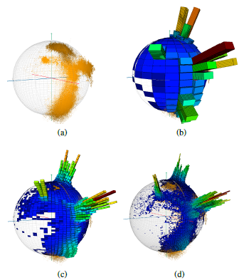
On Visualization and Reconstruction from Non-Uniform Point Sets using B-Splines
Erald Vuçini, Torsten Möller and M. Eduard Gröller 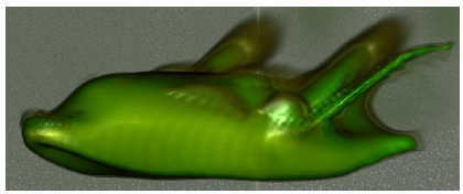
Collaborative Brushing and Linking for Co-located Visual Analytics of Document Collections
Petra Isenberg and Danyel Fisher – In this paper they discuss a collaborative interface to interact with a collection of documents. The collaborative interface is called Cambiera and is a table top analytics tool. You can also see a video of users interacting with Cambiera on Youtube. 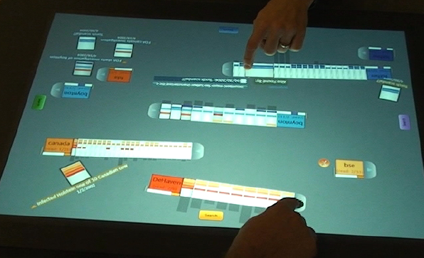
Here are some of the other papers that I thought were very interesting and hope to go through them in more detail (as they become available) :
Illuminated 3D Scatterplots
Harald Sanftmann, Daniel Weiskopf – In this paper, the authors tackled an important and challenging problem of visualizing 3D scatterplots. 2D scatterplots are well known to convey data effectively. The use of illumination to better visualize the 3D nature of the data was a very elegant solution and seems to work quite well. 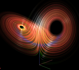
Instant Volume Visualization using Maximum Intensity Difference Accumulation
Stefan Bruckner and M. Eduard Gröller – This paper proposes a novel way to integrate along the ray in the volume rendering process. The idea is very unique and provides excellent results. Since techniques such as MIP, DVR are part of every volume rendering course, seeing such novel and interesting techniques is always exciting. 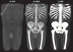
Semi-Automatic Time-Series Transfer Functions via Temporal Clustering and Sequencing
Jonathan Woodring, Han-Wei Shen – Time-varying data visualization is always challenging due to the large amounts of data that needs to be visualized. The authors propose a clustering and sequencing based technique to generate ‘semi-automatic’ transfer functions for the data. 
A Directional Occlusion Shading Model for Interactive Direct Volume Rendering
Mathias Schott, Vincent Pegoraro, Charles Hansen, Kévin Boulanger, Kadi Bouatouch – I enjoyed reading this paper a lot since people rarely seem to talk about anything other than ambient occlusion these days. This paper presents an elegant and unique way to provide occlusion shading with reasonable frame rates. Looking forward to implementing this soon. 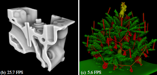
Visualization of Vessel Movements
Niels Willems, Huub van de Wetering, Jarke J. van Wijk – This paper provides a very beautiful solution to the problem of visualizing vessels coming in and out of a port. I enjoy reading J. J. van Wijk’s papers and this and the next one are not any different. 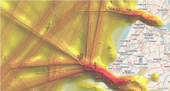
Force-Directed Edge Bundling for Graph Visualization
Danny Holten, Jarke J. van Wijk – The authors follow up on the excellent paper from IEEE Vis 2005 on ‘Hierarchical Edge Bundles: Visualization of Adjacency Relations in Hierarchical Data‘ (which was mentioned in one of my previous posts on Seminal infovis papers), with another great paper. This paper has already received a lot of attention here, here and here. Here is a screenshot showing migration patters in the united states. 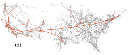
Context-Aware Volume Modeling of Skeletal Muscles
Zhicheng Yan, Wei Chen, Aidong Lu, David Ebert
Map Displays for the Analysis of Scalar Data on Cerebral Aneurysm Surfaces
Mathias Neugebauer, Rocco Gasteiger, Oliver Beuing, Volker Diehl, Martin Skalej, Bernhard Preim
Visual Analysis of Brain Activity from fMRI Data
Firdaus Janoos, Boonth Nouanesengsy, Raghu Machiraju, Han Wei Shen, Steffen Sammet, Michael Knopp, István Á. Mórocz
Visualization tools and their use
In the past, I have discussed visualization tools and a few companies that make them. They are used by a wide variety of professionals such as the Business Intelligence community, Scientific Data explorers, Financial data analysts and many more users.
I feel though that more often than not such tools are an afterthought in a company’s think tank and require a significant amount of training, learning and overcoming a mental block by the senior management of a company. Companies such as Tableau Software, Spotfire, and many others must have excellent sales teams which, on identifying companies that may be able to benefit from their really stellar software, have to then pitch it to them. Even if the software blows the company management away, the reluctance on their part in adopting it surely must be a problem. Additionally, I am sure that even if the top management think its a great idea, the real users (lower level management/marketing/sales professionals) might not have the time and willingness to invest into using the software.
I know that the people behind these visualization companies are brilliant researchers who are not only innovating in the field of visualization but also taking the extra effort to improve on proven visualization techniques in order to make them easy to use.
I feel very strongly about this matter and wonder if a few things can be done to avoid this situation in the future. Clearly, just as training radiologists and other medical software users to use 3D volume rendering software is an uphill task, training business analysts to use visualization tools must be a difficult task.
1 – Provide an educational version of the software that can be available and used only through academic institutions. They could be fully featured or have only some evaluation features but let your software be one of the first tools that students use when analyzing their data. That will ensure that at least a few of them will be trained in using the tool when they go on to join a company and root for your visualization software at the company. If you think about it, companies like Microsoft allow free downloads of their express edition of Visual Studio for students which ensures a familiarity with the software that developers then take to companies when they join there. In my experience, students are far more ready to learn new software and technologies as compared to senior management in a company. They also have more time on their hands and can devote more time to learn the spiffy new features in your visualization software.
2 – Developing a course or two for data analysis in conjunction with a professor at a university – Merely providing educational versions of the software is of limited value. An interesting data analysis course that teaches use of your software or two/three other similar software tools along with basics of data analysis and an overview of visualization techniques might be another interesting way to approach the problem.
3 – Provide easy to use learning material – Take the time and make sure to have tutorials and multitudes of examples on your website that will allow users to use them and improve over time. Having a free PDF book or a step-by-step tutorial can vastly benefit the user and take some load off of your hands for training purposes. Tableau software does an amazing job in the training realm as can be seen by the examples at http://www.tableausoftware.com/learning/examples. You can even download a ‘workbook’ for each example and play around with it in your copy of the software.
4 – Provide free training in the form of Webcasts – Recently, nvidia had a few webcasts focused on CUDA and its applicability for general purpose computing on the GPU. The webcast consisted of a few nvidia developers giving a presentation and answering some questions at the end. The webcast was free and was a great way to indoctrinate a few more researchers to use CUDA for which they would have to buy nvidia graphics cards. I thought it was a great idea which could be taken even further when applied to visualization software. If your users already have a running software, then publishing sample datasets and walking them through it can be even more compelling and interactive than reading an online tutorial or a book chapter.
5 – Providing training at a conference or a workshop might be another way to get users to download your evaluation version and play with some data. Google has been doing similar ‘training’ at conferences like SIGGRAPH and IEEE Visualization for the last couple of years now. This helps you get new users as well as allow for professionals attending the conference to learn something they might convey to their company when they go back to work, which could translate into acceptance and added sales for the company.
If you have any other suggestions, please feel free to let me know. Sorry there are no pretty visualizations in this post 🙂
IEEE Visualization 2008 papers review
Here’s a really late review of some of my favorite papers from the IEEE Visualization 2008 conference.

IEEE Visualization Conference
Size-based Transfer Functions: A New Volume Exploration Technique – Carlos D. Correa, Kwan-Liu Ma
The idea is to automatically color various features of a dataset based on the local scale of the features. Reading their paper and looking at their amazing images make their techniques seem deceptively easy. You have to only see some of Carlos’ previous work to realize that his visualizations are always impressive and his papers easy to read.
Direct Volume Editing – Kai Bürger, Jens Krüger, Rüdiger Westermann
This paper introduces interactive volume editing. The idea is to allow a user control over the visual appearance of a volume, much like an image editor allows you to edit an image. Here they allow for interactive editing of the volume which includes annotation, coloring and much more. Some of their results are just amazing and could easily pass off as hand-drawn illustrations.
VisComplete: Automating Suggestions for Visualization Pipelines – David Koop, Carlos E. Scheidegger, Steven P. Callahan, Juliana Freire, Cláudio T. Silva
This paper is from a long series of papers that showcase the strength of provenance. VisTrails was first introduced at the IEEE Visualization 2005 conference with a demo given by Carlos Scheidegger at the VTK Birds-of-a-Feather session. Since then, not only has it blossomed into a complete and extremely useful product (and spawned a company, VisTrails Inc.). They have published some award winning papers like the IEEE Visualization 2007 Best Paper VisComplete: “Querying and Creating Visualizations by Analogy.” Additionally, many products (Paraview, Maya) are taking note of the power of provenance and working with VisTrails Inc. to incorporate it into their workflow. You can find more information about provenance and VisTrails at http://www.vistrails.org/index.php/Publications_and_Presentations.
Color Design for Illustrative Visualization
Lujin Wang, Joachim Giesen, Kevin T. McDonnell, Peter Zolliker, Klaus Mueller
This was a particularly interesting paper since it presented an interesting approach to picking colors for illustrative visualization. I have posted previously on Illustrative visualization and think that it is an exciting field and has many challenges that include perception, cognition and abstraction. It is not merely a stylistic issue but a representational issue where what is shown to the viewer has to be carefully identified and more importantly what is not shown has to be conveyed to the viewer using context or visual cues to convey to the viewer that there is more data that is being abstracted out. Anyway, I enjoyed this paper in particular and look forward to some more papers this year.
Effects of Video Placement and Spatial Context Presentation on Path Reconstruction Tasks with Contextualized Videos
Yi Wang, Doug Bowman, David Krum, Enylton Coelho, Tonya Smith-Jackson, David Bailey, Sarah Peck, Swethan Anand, Trevor Kennedy, Yernar Abdrazakov
In this paper, the authors presented a system that provides context during virtual navigation using correctly placed videos. An interesting finding in the paper was that participants in their user study were able to perform tasks in unfamiliar environments using only virtual navigation as compared to participants who were navigating in familiar virtual environments. Such work can have a considerable impact on video surveillance systems.
Interactive Visual Steering – Rapid Visual Prototyping of a Common Rail Injection System
Krešimir Matković, Denis Gračanin, Mario Jelović, Helwig Hauser
This was a particularly well presented case study where visualization was used for interactive steering in a real world scenario. The authors were candid enough to discuss their design choices and I think we need many more such papers where the process of refinement and discussion is presented to help readers see the iterations instead of a nice finished final product that does everything the collaborators wanted. It was interesting to see the use of multiple coordinated views and parallel coordinates and to read their experiences with using it.
Text Scaffolds for Effective Surface Labeling
Gregory Cipriano, Michael Gleicher
I enjoyed reading this paper and secretly wished that I had developed such a nice way to label data. The paper discusses a technique to label surface data that follows the contours of the surface in a manner similar to what illustrators do when they label illustrations. The images presented in the paper were great and some of the work coming from their group has been particularly interesting. I would also like to draw your attention to their paper from last year’s Vis conference -“Molecular Surface Abstraction“.
Were there any specific papers you liked that I may have missed? Please feel free to comment.
IEEE VisWeek 2008 – Panels overview
As part of Visweek, there were a few Panels which I have consistently enjoyed through all these years. The first panel was on
Grand Challenges for Information Visualization
Panelists: Georges Grinstein, Daniel Keim and Tamara Munzner. All the panelists are well known to the community and provided some very interesting ideas.
Tamara Munzner gave an interesting talk which resonated with that I believe is necessary for our field. She emphasized on the fact that we “need open software for open data.” On numerous occasions, we see wonderful visualization techniques at conferences and in the IEEE TVCG journal, but rarely do we see the source code with some sample datasets being made available. I particularly applaud efforts such as Many eyes, VisTrails and some other visualization toolkits (which I cant think of right now) that allow not only visualization but also some information regarding how the visualization was created. Vistrails goes much farther and even provides detailed information regarding the steps taken by a user to reach a certain point.
Tamara also proposed a common framework which seems inspired by the field of security and software engineering. It was an interesting way to deal with providing visualization solutions to real world application domain problems. Here slides can be found at www.cs.ubc.ca/~tmm/talks/vis08/vis08.pdf
I think that some of the ideas that they discussed in the panel are crucial to our field of visualization (not just infovis). We need to make sure that we have something more than a long list of papers (textbooks/introductory 1-day workshops at conferences for first time attendees) for new students and practitioners. I am glad to see such enthusiasm and fervor as was palpable at the panel and hope to see many more such events that make us think as a community. I wasnt able to attend the entire panel and so if any of you have any comments on the same, please feel free to add them here.
Building a Research Group in Visualization
Panelists: Hamish Carr, Sheelagh Carpendale, Thomas Ertl, Helwig Hauser, Chris Johnson, Min Chen, Stephen North
This panel was hosted by Hamish Carr, who is at the University College Dublin. The panel started out with each of the esteemed panelists discussing what worked and how things worked out for them as a researcher as well as a research group.
Sheelagh Carpendale spoke first and basically said that she had identified five components to ‘success’ as regards forming a creative, productive research group. The five components are (i) Collaboration – Where multiple students collaborate and get more done by helping each other out. (ii) Competition – where students or sub-groups within the lab compete in a healthy manner towards evaluating techniques, developing software modules etc. (iii) Mentoring – Each new student is paired up with a senior member in the lab to help with adjusting to the lab as well as getting up to speed with research in the field. (iv) Individualism – It is critical to identify individual pieces for students so that they can claim ownership of a part of the project. She mentioned that its also important to encourage students to think on their own. (v) Scaffolding – Last but not the least, scaffolding is the glue that provides a productive environment to the students and researchers in the lab. Providing students with sufficient, high quality resources helps them achieve their goals as well as helps the faculty member achieve their goals.
Min Chen focused on challenges of leading a smallish research group. He spoke about how the Research Assessment Exercise (RAE) process helped and shaped his research group as well as the department’s growth at Swansea University, UK. Particularly, he spoke about how he read books on managing groups such as ‘Handbook of Small Group Research‘ by A. Paul Hare, which apparently is out of circulation. The amusing part of his talk was that the book had examined criminal gangs and figured out some of the rules and ideas about what works and doesnt work from observing gang leaders and the gang as a whole. He also spoke on how their group outings are mostly research focused and that has helped them grow as well as form connections with other faculty in the department.
Thomas Ertl spoke next on how his experience in astrophysics as well as industry helped him immensely. He said that having started his own company before becoming a faculty member, convinced him of the need of selling. By selling he meant selling an idea, a concept and so on. He said that writing skills can definitely be improved and there is no excuse to poor communication skills. One needs to be able to convince the reader/person sitting in front of you of the viability of your idea/algorithm/system. He said that “Success is a combination of individual performance and how others perceive you.” He said that in his lab he has always encouraged collaboration as opposed to competition.
Helwig Hauser spoke about the balance between demands (financial, research, departmental) as a professor versus own choices as regards research, research topic etc. He said that one should always keep an eye on the practical assets when conducting research. He defined them as software, algorithms and tools. He also spoke about the need to balance reactive vs proactive approaches to research. In some cases, one needs to work on a project to fund the research that one is more interested in.
Chris Johnson discussed how his small research lab of one student grew to a small research group and that grew into a large research group which in turn grew into a centre and now its a huge institute (Scientific Computing and Imaging Institute). He said that only through collaborations and having a big group of smart people around you, can you do more interesting science than just by working by yourself. He spoke abut how its always challenging to manage large groups but he said that they are very careful when hiring new faculty/researchers since one disgruntled person can make the environment unproductive.
Stephen North from AT&T Research labs gave the industry perspective to managing research groups. He said that the funding is more or less stable but its very important to have executive support from within the company. He said that long term goals and views are important for a research group, but also said that its not always possible to meet all the long term goals.
This was followed by an excellent discussion where attendees asked panelists some insightful questions. Instead of trying to summarize the interaction, I would like to direct you to Carlos Scheidegger’s excellent summarization of the Q&A session that followed.
Unfortunately, I could not make it to the Visual Analytics panel. Please let me know if any of you attended that session.
IEEE Vis 2008 Keynote – Margaret Livingstone
What Art Can Tell Us About the Brain
Margaret S. Livingstone, Professor of Neurobiology, Harvard Medical School
I knew the keynote talk at the IEEE Visualization conference was going to be interesting when the student volunteer at the door handed me stereo glasses before the talk. The talk was focused on introducing concepts about color and luminance that artists have been using effectively for hundreds of years.
In the first part of the talk, she focused on introducing concepts such as centre-surround.
Some of the highlights from her talk are as follows:
– In some cases, color contrast is not equal to luminance contrast.
– People are good at recognizing objects from different points of view. This might be interesting since there seems to be considerable amount of work in graphics and visualization on finding the ‘best’ view for a particular dataset.
– Equiluminance – In the paper “Vernier and Displacement Thresholds in Equiluminance” by Masami Funakawa, equiluminance is introduced as follows
The notion of equiluminance is based upon the assumption that in the human visual system there are two kinds of visual pathway, i.e., luminance and chromatic pathway. An equiluminous stimulus varies in color, but not in luminance, so that it is assumed to be signaled by the chromatic system, but not by the luminance system. In psychophysical studies these stimuli are used to isolate and probe the chromatic system.
This webpage describes the use of equiluminance in art and how luminance affects our perception http://www.webexhibits.org/colorart/anuszkiewicz.html
– Depth can be conveyed using motion, shading, perspective projection, occlusion and stereopsis.
– Luminance contrast: As long as the luminance is appropriate, shape can be conveyed. She showed some interesting examples of paintings [Matisse’s The Woman in a Hat] and visual representations, where the colors were unnatural but it did not affect the perceived shape of face/object.
– Yellow, Blue and White, when used appropriately can convey motion in static images. This was demonstrated by showing some work by Akiyoshi Kitaoka’s Rotating Snakes (left image below) and Mondrian’s Broadway Boogie Woogie. It reminded me of the SIGGRAPH 2008 paper on
Self-Animating Images: Illusory Motion Using Repeated Asymmetric Patterns by Ming-Te Chi et al.
The images in this paper seem to use a similar principle and are very effective and conveying motion.
– Our central vision has high acuity whereas our peripheral vision was lower acuity. We dont seem to notice the fact that our peripheral vision has lower resolution since we move our eyes rapidly over scenes. This reminded me of the keynote from IEEE Vis 2004, where the speaker, Wilson Geisler, gave an amazing demonstration of this phenomena.
She said that Mona Lisa’s smile was particularly enigmatic since one feels her expression changing depending on whether one focuses on the eyes or the mouth. Her lab has conducted research on the same and by filtering if they have been able to create representations of how our peripheral and central vision interpret the painting, as shown here

The last part of the talk focused on the use of stereopsis by artists in making more realistic paintings. She found that many artists lack the ability to see stereopsis and that makes them see a flat world which they capture on canvas. This can be identified by looking at the glint in the eye of the photo/painting and if both the glints are not synchronized, chances are that the person lacks the ability to see stereopsis. Through her research, she found many famous artists to have misaligned eyes including the painter Rembrandt. Photographs of Babe Ruth too seemed to imply that he had misaligned eyes.


The end of the talk kept us wanting for more and I guess that implies that it was a great keynote talk.


