Archive for the ‘information visualization’ Category
Visweek 2011 – Perception and Cognition for Visualization, Visual Data Analysis & Computer Graphics

I had mentioned in an earlier post that this tutorial promises to be an amazing one and so it was. Here is an outline of the workshop.
Bernice E. Rogowitz covered fundamentals in human perception and cognition, and discussed how they apply to visualization. She covered a huge array of topics, ranging from the pupil being partially responsible for our depth perception, all the way to color theory and how it relates directly to the biology of the human eye.
The presentation had a great flow, starting at a very high level to give everyone an idea of what questions they would be able to answer at the end. As the talk progressed, she covered detailed biological details of the human eye, and progressed to the intersection of perceptual issues and computer science.
In the biological portion, we learned that there are five layers of cells in the retina, each responsible for different tasks. Much of the interesting stuff happens at the very beginning (photoreceptor distribution) and then further into the process at the ganglion cells. She went over how lateral inhibition is caused by the spatial distribution of the photoreceptors connected to a single ganglion cell, and how this is the reason for several of the optical illusions we perceive. She did a great job of explaining the connections between biology and perceptual issues.
Cultural differences were also addressed. The eye movements we have are actually learned when we learn how to read. Cultures with different reading directions have substantially different reading directions.
The section on the Striate Cortex was especially interesting. This is the first time in the visual system that images from each eye are merged (the point where depth perception occurs). This section sends output to 60% of the brain! This is a huge amount, and makes the visual system incredibly important to the decision making process.
This tutorial had a huge quantity of useful information and was really well put together! She concluded with a great summary of four things to remember:
- There are different response rates for different stimuli, how well do you want to convey magnitude information?
- Color and luminance mechanisms have different spatial sensitivities.
- Certain visual information is perceived “pre-attentively” such as color.
- How the world is perceived depends on what the user is trying to accomplish.
Visweek 2011 is upon us!

The annual IEEE Visualization, IEEE Information Visualization and IEEE Visual Analytics Science and Technology conferences – together known as IEEE Visweek will be held in Providence, RI from October 23rd to October 28th.The detailed conference program is spectacular and can be downloaded here.Some of the new events this year are under the Professional’s Compasscategory. It includes a Blind date lunch (where one can meet some researcher they have never met and learn about each others research), Meet the Editors (where one can meet editors from the top graphics and visualization journals), Lunch with the Leaders session (an opportunity to meet famous researchers in the field) and Meet the faculty/postdoc candidates (especially geared towards individuals looking for a postdoctoral position or a faculty position). I think this is an excellent idea and hope that the event is a hit at the conference.I am also eagerly looking forward towards the two collocated symposia – IEEE Biological Data Visualization (popularly known as biovis) and IEEE LDAV (Large data analysis and visualization). Their excellent programs are out and I’d encourage you to take a look at them.
The tutorials this year look great and I am particularly looking forward to the tutorial on Perception and Cognition for Visualization, Visual Data Analysis and Computer Graphics by Bernice Rogowitz. Here is an outline for the tutorial that can be found on her website. She was one of the first people to recommend that people STOP using the rainbow color map.
The telling stories with data workshop too looks great and will be a continuation of the great tutorial held by the same group last year. I am eagerly looking forward to it.
Apart from this are the excellent papers that will be presented at the conference. I shall write another post about the ones I am particularly looking forward to. With so many exciting events going on, it almost seems like a crime to have all of them happening in the span of a few days.
I shall definitely be blogging about the event as much as I can. You can also follow me on twitter, which will have more real time tweets than the blog which will distil a days worth of information into a post.
Let me know if you are going to be around and I’ll be happy to talk to you.
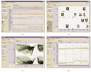
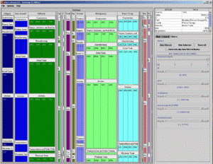
Visualization for Fraud Detection
Data visualization is being used for detecting fraud, especially with respect to wire and credit card transactions. Work done at the Charlotte Visualization Center at UNC Charlotte provides some interesting insights into fraud detection. This work was conducted in collaboration with the Bank of America.In the following paper they highlight four visualization techniques that allow for fraud detection.
Scalable and Interactive Visual Analysis of Financial Wire Transactions for Fraud Detection, Remco Chang, Alvin Lee, Mohammad Ghoniem, Robert Kosara, William Ribarsky, Jing Yang, Evan Suma, Caroline Ziemkiewicz, Daniel Kern, Agus Sudjianto, Journal of Information Visualization (IVS).
Heatmap: A heatmap depicting the relationship between accounts and transactions.
Search by example: Find accounts with transactions/activity similar to the current account being monitored.

Strings and beads: A line graph based visualization that shows critical events as ‘beads’ on the graph. The use of a log scale for the y-axis is a neat idea and probably allows for improved exploration. 
Keyword graph: A graph visualization showing keyword similarity  This paper was based on previous work done by the same group titled Wirevis. I would encourage interested readers in reading the original paper as well as the previous paper (Wirevis).
Centrifuge Systems, a Virginia based company, have developed data visualization software for fraud analysis.

- It is a web-based solution that allows interactive exploration of data for fraud detection.
- Can read a wide variety of file formats (excel/access databases).
- Allows interaction with visualizations such as node-link diagrams, bar charts etc.
You can check out a 10-min video on their website at http://www.centrifugesystems.com/shadowbox/libraries/mediaplayer/Centrifuge-1.8-for-Banking-Fraud-Analysis.flv. As per the company website, it has been used to detect fraud in Bulgaria called the “Bulgarian Money Mule ring”. Seems like a step in the right direction. It would be interesting to see, if they could save and share workspaces for collaborative exploration of data. With their web-based framework, it would make it particularly interesting for investigators located at different locations to immediately access and interact with the current state of the visualization.
Any other companies, products, research papers that you may have heard of that I missed?
Interactive visualization at your fingertips
 With today’s release of Tableau Public, Tableau Software has opened up infinite possibilites for researchers, corporations and enthusiasts alike to interact, explore and play with their data. More importantly, with Tableau Public one can now have ‘interactive’ visualizations online as opposed to static images. This is a step in the right direction for Data Visualization software, since increasingly one hears from domain experts who want to ‘use’ software and not have to write programs (however small or easy those programs may seem to the developer of the software). Tableau now allows researchers to explore their data and collaborate more effectively instead of having to share static ‘screenshots’ via email.
Such uses of visualization software have already been explored and shown to be hugely successful by the ManyEyes team in their CHI ’08 paper, but the capabilities and strengths of both the products are in somewhat disjoint areas. For example, Tableau focuses on the Business Intelligence community and lacks certain visualizations such as Treemaps or Text visualizations (which ManyEyes seem to do really well). Other interesting and inspiring uses of Tableau Public can be found in their Gallery at http://www.tableausoftware.com/public/gallery. Dont forget to check out the NYC Graffiti workbook that they have online. Detailed training videos can be found at http://www.tableausoftware.com/public/training
ManyEyes – Reader  s of this blog already know my fondness for IBM’s Many Eyes. ManyEyes has been a pioneer in this field of online visualization software that facilitates data visualization without the need for programming. Research papers from the Many Eyes team detailing user interactions and unexpected uses of the visualization software can be found at http://bewitched.com/manyeyes.html
Verifiable is another  such website that allows online visualization of data. So far the data visualizations that are possible are limited to bar charts, scatter plots and line charts but the trend is definitely promising and I hope they continue to improve the excellent service. A video can be found online at http://verifiable.com/screencast
Swivel is similar to  Verifiable, where one can upload data and create online interactive visualizations. Videos for all the features in Swivel can be found at http://www.swivel.com/features. Unfortunately, they have a 15-day free trial that restricts the widespread use of their tools.
As I interact with experts and students from domains as wide as political sciences, biology, economics and so on, I am pleased to hear the awareness that they have for effective visualization but I am sometimes disheartened to have to tell them to learn programming to learn some of our nifty tools. Tableau Public, IBM Many Eyes and others are exceptional in the service that they provide. I envision more research groups, corporate websites and so on posting interactive visualizations with a ‘Powered by Tableau’ icon or something similar in the bottom right corner.
Things to look out for at InfoVis 2009

InfoVis (Information Visualization) 2009 is an integral part of the Annual VisWeek conference. This year the VisWeek conference will be held in Atlantic city, NJ from October 11th-16th. In the next few posts, I shall post my views on things to look out for in each of the tracks at the VisWeek conference: VAST, Vis and Infovis. Here are some exciting talks/panels/workshops/tutorials that I’m looking forward to at InfoVis this year (Links and other material shall be updated as material becomes available):
Workshops:
Collaborative Visualization on Interactive Surfaces (CoVIS)
Organizers: Petra Isenberg, Michael Sedlmair, Dominikus Baur,
Tobias Isenberg, Andreas Butz
Tutorials:
Visualization and Analysis Using VisIt
Organizer: Hank Childs
Exploring Design Decisions for Effective Information Visualization
Organizers: Jo Wood, Jason Dykes, Aidan Slingsby
Keynote: Visual Thinking and Visual Thinking Tools
Speaker: Colin Ware, Data Visualization Research Lab, University of New Hampshire
Panels:
Changing the World with Visualization
Organizer: Robert Kosara
Panelists: Sarah Cohen, Jerome Cukier, Martin Wattenberg
Papers:
InfoVis Best Paper Award
ABySS-Explorer: Visualizing Genome Sequence Assemblies
Cydney B. Nielsen, Shaun D. Jackman, Inanç Birol, Steven J.M. Jones
InfoVis Best Paper Award
Mapping Text with Phrase Nets
Frank van Ham, Martin Wattenberg, Fernanda B. Viégas
InfoVis Honorable Mention
MizBee: A Multiscale Synteny Browser
Miriah Meyer, Tamara Munzner, Hanspeter Pfister
InfoVis Honorable Mention
Configuring Hierarchical Layouts to Address Research Questions
Aidan Slingsby, Jason Dykes, Jo Wood
InfoVis Honorable Mention
SellTrend: Inter-Attribute Visual Analysis of Temporal Transaction
Data, Zhicheng Liu, John Stasko, Timothy Sullivan
Spatiotemporal Analysis of Sensor Logs using Growth Ring Maps
Peter Bak, Florian Mansmann, Halldor Janetzko, Daniel A. Keim
A Nested Model for Visualization Design and Validation
Tamara Munzner
“Search, Show Context, Expand on Demand”: Supporting Large Graph Exploration with Degree-of-Interest
Frank van Ham, Adam Perer
A Comparison of User-Generated and Automatic Graph Layouts,
Tim Dwyer, Bongshin Lee, Danyel Fisher, Kori Inkpen Quinn, Petra Isenberg, George Robertson, Chris North
Visualizing Social Photos on a Hasse Diagram for Eliciting
Relations and Indexing New Photos, Michel Crampes, Jeremy de Oliveira-Kumar, Sylvie Ranwez, Jean Villerd
Bubble Sets: Revealing Set Relations with Isocontours over Existing Visualizations
Christopher Collins, Gerald Penn, Sheelagh Carpendale
Temporal Summaries: Supporting Temporal Categorical Searching, Aggregation and Comparison
Taowei David Wang, Catherine Plaisant, Ben Shneiderman, Neil Spring, David Roseman, Greg Marchand, Vikramjit Mukherjee, Mark Smith
Lark: Coordinating Co-located Collaboration with Information Visualization – YouTube Video – Paper link
Matthew Tobiasz, Petra Isenberg, Sheelagh Carpendale
Harnessing the Web Information Ecosystem with Wiki-based Visualization Dashboards
Matt McKeon
SpicyNodes: Radial Layout Authoring for the General Public
Michael Douma, Grzegorz Ligierko, Ovidiu Ancuta, Pavel Gritsai, Sean Liu
code swarm: A Design Study in Organic Software Visualization
Michael Ogawa, Kwan-Liu Ma
Protovis: A Graphical Toolkit for Visualization
Michael Bostock, Jeffrey Heer
Participatory Visualization with Wordle
Fernanda B. Viégas, Martin Wattenberg, Jonathan Feinberg
Capstone: Visual aids: Use of Paintings and Photography for Lighting in the Theater
Speaker: Brian MacDevitt, Broadway Lighting Designer
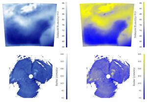
Visualizing Environmental Factors
In this post, I focus on the use of visualization in conveying information regarding the environment, pollution, population effects on the planet and similar issues. The visualizations are particularly powerful and make us realize how much of an impact we have on the world.
- Breathing Earth is a wonderful visualization that shows a visual representation of the amount of CO2 that is being produced every second. Additionally, based on the statistics there is a neat visual representation of number of births and deaths per second. This image is just a snapshot of the ever evolving visualization. Check out the really eye-opening visualization at http://www.breathingearth.net/

- The Global Footprint Network is an amazing resource that provides information about our footprint on the planet. Other than the excellent scientific resources, they have a quiz that lets you know your carbon footprint at the end. The quiz can be taken at http://www.footprintnetwork.org/en/index.php/GFN/page/calculators/. Here’s a screenshot from the quiz which is really well done.

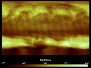
- The Visualization Sciences Group (The company that maintains OpenInventor among other things) has a video showing the amazing capabilities of their visualization software – Avizo Green. The video can be seen at http://www.mc3dviz.com/video/player.php?vfile=avizo/AVIZO_GREEN_mercury640x360.flv. Here is a screenshot from the amazing video. Hedgehogs when visualized over time convey the wind velocity so effectively.

- A research paper by Wood et al. discusses a web-based solution to visualize environmental data. The snapshot below shows a histogram View of Ozone from 3 sites in London – Jason Wood, Ken Brodlie and Helen Wright, Visualization over the World Wide Web and its application to environmental data, Proceedings of IEEE Visualization 1996 Conference, edited by R.Yagel and G.M. Nielson, pp 81–86, ACM Press. ISBN 0-89791-864-9.

- National Public Radio (NPR) had a very informative piece on Visualizing The U.S. Electric Grid – Here are some screenshots from the story. I wonder if they could have picked better visualizations to show the ‘sources of power’.

It is a bit hard to visualize the differences in power generating capabilities of various states since the saturation is mapped to a value. Considering there are only a few different values, using different colors may have been a good idea. Any other thoughts on what they could have used to represent this data more effectively?
Here’s another visual representation of the wind energy sources. 
What seemed most interesting to me is how much the US is dependent on coal power as compared to wind. I hope with the new administration’s initiatives for green energy, we will see a change in the near future.
- Visualizing rainfall in Australia – You can interact with the website to pick different visualizations. They seem to be pre-generated though. Here is a screenshot of one of the visualizations

- NY Times article discussing the growing interest in visualizing and drawing attention to the climate change problem through visualization.
- Globalwarmingart.com is a website dedicated to drawing attention the problem of climate change through the use of visualizations and infographics. Shown here is the now (in)famous ’embers’ graph that the Intergovernmental Panel on Climate Change (IPCC) did NOT include in their report on climate change, since some scientists thought that the visualization “was too unnerving.” Here is the actual figure and its discussion on NYTimes dotEarth blog – http://dotearth.blogs.nytimes.com/2009/02/23/warming-embers-burning-brighter/

- Climate Central – a non-profit organization has some excellent resources that are meant for media and for raising public awareness about the topic of climate change. You can some excellent video as http://www.climatecentral.org/video/. In their own words
Climate Central is an accessible one-stop source for timely, relevant, high-quality climate information through a variety of channels, targeting the media and leaders in business, government, and religion.
- WaterLIFE is a wonderfully informative website that provides information about water. It contains videos, photographs and visualizations that draw your attention to the various factors affecting water. Its a really amazing site and the snapshot below does not do it justice. Anyway, check it out at http://waterlife.nfb.ca/. Here’s a snapshot from their website

Have you seen any other visualization/website that has been used to communicate, inform, educate people about the issues surrounding environmental factors? If so, please feel free to add them in the comments section.
Eurovis 2009 Papers
The Eurovis 2009 conference concluded a few days ago in Berlin. Here are some of the papers that I found interesting. Links for all the papers are not available yet, but I shall update the post as and when I find them. Here is the whole list of accepted eurovis 2009 papers.
The keynote talk was given by Pat Hanrahan who is known to give very insightful and thought provoking keynote and capstone talks. This keynote talk was titled Systems of Thought. You can also take a look at his slides from other talks on this website http://graphics.stanford.edu/~hanrahan/
This year at the conference, they awarded 3 best paper awards. Congratulations to the authors of the papers! These are the ‘best paper award winners’:
Visualisation of Sensor Data from Animal Movement
Edward Grundy, Mark W. Jones, Robert S. Laramee, Rory P. Wilson and Emily L.C. Shepard – In this paper they present a unique way of visualization data obtained from sensors attached to animals as they move around the world. Animals such as the cormorant, sea turtles and such were tagged with tri axial accelerometers and tracked through time.
On Visualization and Reconstruction from Non-Uniform Point Sets using B-Splines
Erald Vuçini, Torsten Möller and M. Eduard Gröller 
Collaborative Brushing and Linking for Co-located Visual Analytics of Document Collections
Petra Isenberg and Danyel Fisher – In this paper they discuss a collaborative interface to interact with a collection of documents. The collaborative interface is called Cambiera and is a table top analytics tool. You can also see a video of users interacting with Cambiera on Youtube. 
Here are some of the other papers that I thought were very interesting and hope to go through them in more detail (as they become available) :
Illuminated 3D Scatterplots
Harald Sanftmann, Daniel Weiskopf – In this paper, the authors tackled an important and challenging problem of visualizing 3D scatterplots. 2D scatterplots are well known to convey data effectively. The use of illumination to better visualize the 3D nature of the data was a very elegant solution and seems to work quite well. 
Instant Volume Visualization using Maximum Intensity Difference Accumulation
Stefan Bruckner and M. Eduard Gröller – This paper proposes a novel way to integrate along the ray in the volume rendering process. The idea is very unique and provides excellent results. Since techniques such as MIP, DVR are part of every volume rendering course, seeing such novel and interesting techniques is always exciting. 
Semi-Automatic Time-Series Transfer Functions via Temporal Clustering and Sequencing
Jonathan Woodring, Han-Wei Shen – Time-varying data visualization is always challenging due to the large amounts of data that needs to be visualized. The authors propose a clustering and sequencing based technique to generate ‘semi-automatic’ transfer functions for the data. 
A Directional Occlusion Shading Model for Interactive Direct Volume Rendering
Mathias Schott, Vincent Pegoraro, Charles Hansen, Kévin Boulanger, Kadi Bouatouch – I enjoyed reading this paper a lot since people rarely seem to talk about anything other than ambient occlusion these days. This paper presents an elegant and unique way to provide occlusion shading with reasonable frame rates. Looking forward to implementing this soon. 
Visualization of Vessel Movements
Niels Willems, Huub van de Wetering, Jarke J. van Wijk – This paper provides a very beautiful solution to the problem of visualizing vessels coming in and out of a port. I enjoy reading J. J. van Wijk’s papers and this and the next one are not any different. 
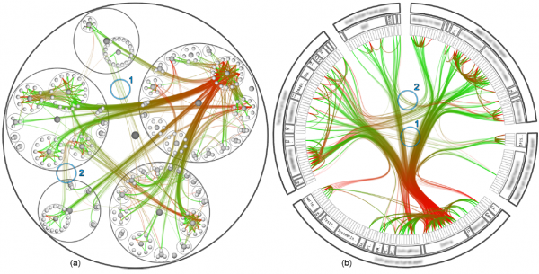
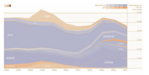
Force-Directed Edge Bundling for Graph Visualization
Danny Holten, Jarke J. van Wijk – The authors follow up on the excellent paper from IEEE Vis 2005 on ‘Hierarchical Edge Bundles: Visualization of Adjacency Relations in Hierarchical Data‘ (which was mentioned in one of my previous posts on Seminal infovis papers), with another great paper. This paper has already received a lot of attention here, here and here. Here is a screenshot showing migration patters in the united states. 
Context-Aware Volume Modeling of Skeletal Muscles
Zhicheng Yan, Wei Chen, Aidong Lu, David Ebert
Map Displays for the Analysis of Scalar Data on Cerebral Aneurysm Surfaces
Mathias Neugebauer, Rocco Gasteiger, Oliver Beuing, Volker Diehl, Martin Skalej, Bernhard Preim
Visual Analysis of Brain Activity from fMRI Data
Firdaus Janoos, Boonth Nouanesengsy, Raghu Machiraju, Han Wei Shen, Steffen Sammet, Michael Knopp, István Á. Mórocz
Seminal information visualization papers
Here is an article that I wrote at Vizworld.com. Vizworld.com is a great resource for all things related to graphics and visualization and is one of the websites that I regularly visit to keep updated with the field. This article has been updated with resources that some of the visitors mentioned in the comments section and I thank them for the same.
I have been thinking about making a list of some of the most seminal information visualization papers. These are papers that have made an impact and can be widely seen in the media (print/web) or are being adopted in visualization software/systems such as VTK, Prefuse, Many Eyes and so on. I may have missed out on a few papers, so please feel free to add any that you think are ‘must-reads’ for an infovis researcher.
Disclaimer: The list in no particular order of preference.
Here’s the list:
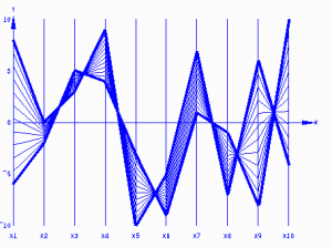
- Cluster and Calendar based Visualization of Time Series Data, Jarke J. van Wijk and Edward R. van Selow, Proc InfoVis 99, p 4-9.

- Polaris: A System for Query, Analysis and Visualization of Multi-dimensional Relational Databases, Chris Stolte, Diane Tang and Pat Hanrahan, IEEE Transactions on Visualization and Computer Graphics, Vol. 8, No. 1, January 2002.
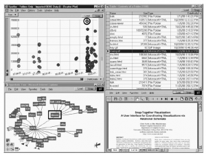
- The Eyes Have It: A Task by Data Type Taxonomy for Information Visualizations, Ben Shneiderman, Proc. 1996 IEEE Visual Languages. An interesting sentence from the paper – “Information exploration is inherently a process with many steps, so keeping the history of actions and allowing users to retrace their steps is important. However, most prototypes fail to deal with this requirement.” I feel that with the amazing ‘provenance’ based work that Claudio Silva’s group at the University of Utah are doing on Vistrails, some of this is being finally addressed.
- How Not to Lie with Visualization, Bernice E. Rogowitz and Lloyd A. Treinish, Computers In Physics 10(3) May/June 1996, pp 268-273.
- Excentric Labeling: Dynamic Neighborhood Labeling for Data Visualization. Jean-Daniel Fekete and Catherine Plaisant. Proc. CHI’99, pages 512-519. There is a new paper this year at EuroVis 2009 that extends the techniques proposed in this paper – Extended Excentric Labeling by Enrico Bertini, Maurizio Rigamonti and Denis Lalanne.
- VisDB: Database Exploration using Multidimensional Visualization, Daniel A. Keim and Hans-Peter Kriegel, IEEE CG&A, 1994
- Parallel Coordinates: A Tool for Visualizing Multi-Dimensional Geometry. Alfred Inselberg and Bernard Dimsdale, IEEE Visualization ‘90, 1990.
- Smooth and Efficient Zooming and Panning. Jack J. van Wijk and Wim A.A. Nuij, Proc. InfoVis 2003, p. 15-22
- Snap-Together Visualization: Can Users Construct and Operate Coordinated Views? Chris North, B. Shneiderman. Intl. Journal of Human-Computer Studies, Academic Press, 53(5), pg. 715-739, (November 2000)
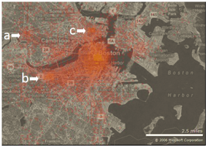
- Hotmap: Looking at Geographic Attention Danyel Fisher, IEEE TVCG 13(6):1184-1191 (Proc. InfoVis 2007).
- Tree visualization with treemaps: a 2-d space-filling approach, Ben Shneiderman, ACM Transactions on Graphics, vol. 11, 1 (Jan. 1992) 92-99 and B. Johnson and B. Shneiderman, “Tree-maps: A Space Filling Approach to the Visualization of Hierarchical Information Structures“, Proc. of Vis ‘91, Oct. 1991, pp. 284-291.
- Danny Holten (2006), Hierarchical Edge Bundles: Visualization of Adjacency Relations in Hierarchical Data, IEEE Transactions on Visualization and Computer Graphics, vol. 12, no 5, pp. 741-748. – This has already been implemented in VTK and is very useful for visualizing hierachical data.
- Tamara Munzner, Francois Guimbretiere, Serdar Tasiran, Li Zhang, and Yunhong Zhou (2003), TreeJuxtaposer: Scalable Tree Comparison using Focus+Context with Guaranteed Visibility, SIGGRAPH 2003 , published as ACM Transactions on Graphics 22(3), pp. 453-462.
- M. Stone, “Choosing Colors for Data Visualization“, 2006.
- Penny Rheingans (1999). Task-based Color Scale Design. Proceedings of Applied Image and Pattern Recognition ‘99, SPIE, pp. 35-43.
- F. Viegas, M. Wattenberg, F. van Ham, J. Kriss, and M. McKeon, “ManyEyes: A Site for Visualization at Internet Scale“, IEEE Trans. on Visualization and Computer Graphics, Vol. 13, No. 6, Nov.-Dec. 2007, pp. 1121-1128.
- J. Heer, S. Card, J. Landay, “prefuse: a toolkit for interactive information visualization“, Proceedings of ACM CHI ‘05, April 2005, pp. 421-430.

- John Lamping , Ramana Rao , Peter Pirolli, A focus+context technique based on hyperbolic geometry for visualizing large hierarchies, Proceedings of the SIGCHI conference on Human factors in computing systems, p.401-408, May 07-11, 1995, Denver, Colorado, United States
- S. Havre, B. Hetzler, and L. Nowell, “ThemeRiver: Visualizing Theme Changes over Time”, Proceedings of the 2000 IEEE Information Visualization Symposium, Salt Lake City, Oct. 2000, pp. 115-123. Image from Theme river inspired work – Stacked Graphs: Geometry & Aesthetics, Lee Byron, Martin Wattenberg, IEEE InfoVis 2008
- M. Wattenberg and J. Kriss, “Designing for Social Data Analysis,” IEEE Transactions on Visualization and Computer Graphics Vol. 12, No. 4, Jul.-Aug. 2006, pp. 549-557.
Other than these papers, these books are a source of invaluable advice about visualizing data.
Books
- Tufte, Edward R. (2001). The Visual Display of Quantitative Information (2nd ed.). Cheshire, CT: Graphics Press. ISBN 0961392142.
- Tufte, Edward R. (1990). Envisioning Information. Cheshire, CT: Graphics Press. ISBN 0961392118.
- Tufte, Edward R. (1997). Visual Explanations: Images and Quantities, Evidence and Narrative. Cheshire, CT: Graphics Press. ISBN 0961392126.
- Few, Stephen (2004). Show Me the Numbers: Designing Tables and Graphs to Enlighten. Analytics Press. ISBN 978-0970601995.
- Few, Stephen (2006). Information Dashboard Design: The Effective Visual Communication of Data. O’Reilly Media. ISBN 978-0596100162.
- Few, Stephen (2009). Now You See It: Simple Visualization Techniques for Quantitative Analysis. Analytics Press. ISBN 978-0970601988.
- Ware, C. (2004) Information Visualization: Perception for Design. (2nd Edition) Morgan Kaufman. December, 435 pages.
- Ware, C. (2008) Visual Thinking for Design. Morgan Kaufman
- Casey Reas and Ben Fry (2007), Processing: A Programming Handbook for Visual Designers and Artists. MIT Press. 736 pages.
- Ben Fry (2007), Visualizing Data, O’Reilly. 384 pages.
- William S. Cleveland (1985). The Elements of Graphing Data, Hobart Press.
- William S. Cleveland (1993). Visualizing Data, Hobart Press.
What other papers/books would you add to this list?
