Posts Tagged ‘ieee visualization 2008’
IEEE Visualization 2008 papers review
Here’s a really late review of some of my favorite papers from the IEEE Visualization 2008 conference.

IEEE Visualization Conference
Size-based Transfer Functions: A New Volume Exploration Technique – Carlos D. Correa, Kwan-Liu Ma
The idea is to automatically color various features of a dataset based on the local scale of the features. Reading their paper and looking at their amazing images make their techniques seem deceptively easy. You have to only see some of Carlos’ previous work to realize that his visualizations are always impressive and his papers easy to read.
Direct Volume Editing – Kai Bürger, Jens Krüger, Rüdiger Westermann
This paper introduces interactive volume editing. The idea is to allow a user control over the visual appearance of a volume, much like an image editor allows you to edit an image. Here they allow for interactive editing of the volume which includes annotation, coloring and much more. Some of their results are just amazing and could easily pass off as hand-drawn illustrations.
VisComplete: Automating Suggestions for Visualization Pipelines – David Koop, Carlos E. Scheidegger, Steven P. Callahan, Juliana Freire, Cláudio T. Silva
This paper is from a long series of papers that showcase the strength of provenance. VisTrails was first introduced at the IEEE Visualization 2005 conference with a demo given by Carlos Scheidegger at the VTK Birds-of-a-Feather session. Since then, not only has it blossomed into a complete and extremely useful product (and spawned a company, VisTrails Inc.). They have published some award winning papers like the IEEE Visualization 2007 Best Paper VisComplete: “Querying and Creating Visualizations by Analogy.” Additionally, many products (Paraview, Maya) are taking note of the power of provenance and working with VisTrails Inc. to incorporate it into their workflow. You can find more information about provenance and VisTrails at http://www.vistrails.org/index.php/Publications_and_Presentations.
Color Design for Illustrative Visualization
Lujin Wang, Joachim Giesen, Kevin T. McDonnell, Peter Zolliker, Klaus Mueller
This was a particularly interesting paper since it presented an interesting approach to picking colors for illustrative visualization. I have posted previously on Illustrative visualization and think that it is an exciting field and has many challenges that include perception, cognition and abstraction. It is not merely a stylistic issue but a representational issue where what is shown to the viewer has to be carefully identified and more importantly what is not shown has to be conveyed to the viewer using context or visual cues to convey to the viewer that there is more data that is being abstracted out. Anyway, I enjoyed this paper in particular and look forward to some more papers this year.
Effects of Video Placement and Spatial Context Presentation on Path Reconstruction Tasks with Contextualized Videos
Yi Wang, Doug Bowman, David Krum, Enylton Coelho, Tonya Smith-Jackson, David Bailey, Sarah Peck, Swethan Anand, Trevor Kennedy, Yernar Abdrazakov
In this paper, the authors presented a system that provides context during virtual navigation using correctly placed videos. An interesting finding in the paper was that participants in their user study were able to perform tasks in unfamiliar environments using only virtual navigation as compared to participants who were navigating in familiar virtual environments. Such work can have a considerable impact on video surveillance systems.
Interactive Visual Steering – Rapid Visual Prototyping of a Common Rail Injection System
Krešimir Matković, Denis Gračanin, Mario Jelović, Helwig Hauser
This was a particularly well presented case study where visualization was used for interactive steering in a real world scenario. The authors were candid enough to discuss their design choices and I think we need many more such papers where the process of refinement and discussion is presented to help readers see the iterations instead of a nice finished final product that does everything the collaborators wanted. It was interesting to see the use of multiple coordinated views and parallel coordinates and to read their experiences with using it.
Text Scaffolds for Effective Surface Labeling
Gregory Cipriano, Michael Gleicher
I enjoyed reading this paper and secretly wished that I had developed such a nice way to label data. The paper discusses a technique to label surface data that follows the contours of the surface in a manner similar to what illustrators do when they label illustrations. The images presented in the paper were great and some of the work coming from their group has been particularly interesting. I would also like to draw your attention to their paper from last year’s Vis conference -“Molecular Surface Abstraction“.
Were there any specific papers you liked that I may have missed? Please feel free to comment.
IEEE VisWeek 2008 – Panels overview
As part of Visweek, there were a few Panels which I have consistently enjoyed through all these years. The first panel was on
Grand Challenges for Information Visualization
Panelists: Georges Grinstein, Daniel Keim and Tamara Munzner. All the panelists are well known to the community and provided some very interesting ideas.
Tamara Munzner gave an interesting talk which resonated with that I believe is necessary for our field. She emphasized on the fact that we “need open software for open data.” On numerous occasions, we see wonderful visualization techniques at conferences and in the IEEE TVCG journal, but rarely do we see the source code with some sample datasets being made available. I particularly applaud efforts such as Many eyes, VisTrails and some other visualization toolkits (which I cant think of right now) that allow not only visualization but also some information regarding how the visualization was created. Vistrails goes much farther and even provides detailed information regarding the steps taken by a user to reach a certain point.
Tamara also proposed a common framework which seems inspired by the field of security and software engineering. It was an interesting way to deal with providing visualization solutions to real world application domain problems. Here slides can be found at www.cs.ubc.ca/~tmm/talks/vis08/vis08.pdf
I think that some of the ideas that they discussed in the panel are crucial to our field of visualization (not just infovis). We need to make sure that we have something more than a long list of papers (textbooks/introductory 1-day workshops at conferences for first time attendees) for new students and practitioners. I am glad to see such enthusiasm and fervor as was palpable at the panel and hope to see many more such events that make us think as a community. I wasnt able to attend the entire panel and so if any of you have any comments on the same, please feel free to add them here.
Building a Research Group in Visualization
Panelists: Hamish Carr, Sheelagh Carpendale, Thomas Ertl, Helwig Hauser, Chris Johnson, Min Chen, Stephen North
This panel was hosted by Hamish Carr, who is at the University College Dublin. The panel started out with each of the esteemed panelists discussing what worked and how things worked out for them as a researcher as well as a research group.
Sheelagh Carpendale spoke first and basically said that she had identified five components to ‘success’ as regards forming a creative, productive research group. The five components are (i) Collaboration – Where multiple students collaborate and get more done by helping each other out. (ii) Competition – where students or sub-groups within the lab compete in a healthy manner towards evaluating techniques, developing software modules etc. (iii) Mentoring – Each new student is paired up with a senior member in the lab to help with adjusting to the lab as well as getting up to speed with research in the field. (iv) Individualism – It is critical to identify individual pieces for students so that they can claim ownership of a part of the project. She mentioned that its also important to encourage students to think on their own. (v) Scaffolding – Last but not the least, scaffolding is the glue that provides a productive environment to the students and researchers in the lab. Providing students with sufficient, high quality resources helps them achieve their goals as well as helps the faculty member achieve their goals.
Min Chen focused on challenges of leading a smallish research group. He spoke about how the Research Assessment Exercise (RAE) process helped and shaped his research group as well as the department’s growth at Swansea University, UK. Particularly, he spoke about how he read books on managing groups such as ‘Handbook of Small Group Research‘ by A. Paul Hare, which apparently is out of circulation. The amusing part of his talk was that the book had examined criminal gangs and figured out some of the rules and ideas about what works and doesnt work from observing gang leaders and the gang as a whole. He also spoke on how their group outings are mostly research focused and that has helped them grow as well as form connections with other faculty in the department.
Thomas Ertl spoke next on how his experience in astrophysics as well as industry helped him immensely. He said that having started his own company before becoming a faculty member, convinced him of the need of selling. By selling he meant selling an idea, a concept and so on. He said that writing skills can definitely be improved and there is no excuse to poor communication skills. One needs to be able to convince the reader/person sitting in front of you of the viability of your idea/algorithm/system. He said that “Success is a combination of individual performance and how others perceive you.” He said that in his lab he has always encouraged collaboration as opposed to competition.
Helwig Hauser spoke about the balance between demands (financial, research, departmental) as a professor versus own choices as regards research, research topic etc. He said that one should always keep an eye on the practical assets when conducting research. He defined them as software, algorithms and tools. He also spoke about the need to balance reactive vs proactive approaches to research. In some cases, one needs to work on a project to fund the research that one is more interested in.
Chris Johnson discussed how his small research lab of one student grew to a small research group and that grew into a large research group which in turn grew into a centre and now its a huge institute (Scientific Computing and Imaging Institute). He said that only through collaborations and having a big group of smart people around you, can you do more interesting science than just by working by yourself. He spoke abut how its always challenging to manage large groups but he said that they are very careful when hiring new faculty/researchers since one disgruntled person can make the environment unproductive.
Stephen North from AT&T Research labs gave the industry perspective to managing research groups. He said that the funding is more or less stable but its very important to have executive support from within the company. He said that long term goals and views are important for a research group, but also said that its not always possible to meet all the long term goals.
This was followed by an excellent discussion where attendees asked panelists some insightful questions. Instead of trying to summarize the interaction, I would like to direct you to Carlos Scheidegger’s excellent summarization of the Q&A session that followed.
Unfortunately, I could not make it to the Visual Analytics panel. Please let me know if any of you attended that session.
IEEE Vis 2008 Keynote – Margaret Livingstone
What Art Can Tell Us About the Brain
Margaret S. Livingstone, Professor of Neurobiology, Harvard Medical School
I knew the keynote talk at the IEEE Visualization conference was going to be interesting when the student volunteer at the door handed me stereo glasses before the talk. The talk was focused on introducing concepts about color and luminance that artists have been using effectively for hundreds of years.
In the first part of the talk, she focused on introducing concepts such as centre-surround.
Some of the highlights from her talk are as follows:
– In some cases, color contrast is not equal to luminance contrast.
– People are good at recognizing objects from different points of view. This might be interesting since there seems to be considerable amount of work in graphics and visualization on finding the ‘best’ view for a particular dataset.
– Equiluminance – In the paper “Vernier and Displacement Thresholds in Equiluminance” by Masami Funakawa, equiluminance is introduced as follows
The notion of equiluminance is based upon the assumption that in the human visual system there are two kinds of visual pathway, i.e., luminance and chromatic pathway. An equiluminous stimulus varies in color, but not in luminance, so that it is assumed to be signaled by the chromatic system, but not by the luminance system. In psychophysical studies these stimuli are used to isolate and probe the chromatic system.
This webpage describes the use of equiluminance in art and how luminance affects our perception http://www.webexhibits.org/colorart/anuszkiewicz.html
– Depth can be conveyed using motion, shading, perspective projection, occlusion and stereopsis.
– Luminance contrast: As long as the luminance is appropriate, shape can be conveyed. She showed some interesting examples of paintings [Matisse’s The Woman in a Hat] and visual representations, where the colors were unnatural but it did not affect the perceived shape of face/object.
– Yellow, Blue and White, when used appropriately can convey motion in static images. This was demonstrated by showing some work by Akiyoshi Kitaoka’s Rotating Snakes (left image below) and Mondrian’s Broadway Boogie Woogie. It reminded me of the SIGGRAPH 2008 paper on
Self-Animating Images: Illusory Motion Using Repeated Asymmetric Patterns by Ming-Te Chi et al.
The images in this paper seem to use a similar principle and are very effective and conveying motion.
– Our central vision has high acuity whereas our peripheral vision was lower acuity. We dont seem to notice the fact that our peripheral vision has lower resolution since we move our eyes rapidly over scenes. This reminded me of the keynote from IEEE Vis 2004, where the speaker, Wilson Geisler, gave an amazing demonstration of this phenomena.
She said that Mona Lisa’s smile was particularly enigmatic since one feels her expression changing depending on whether one focuses on the eyes or the mouth. Her lab has conducted research on the same and by filtering if they have been able to create representations of how our peripheral and central vision interpret the painting, as shown here

The last part of the talk focused on the use of stereopsis by artists in making more realistic paintings. She found that many artists lack the ability to see stereopsis and that makes them see a flat world which they capture on canvas. This can be identified by looking at the glint in the eye of the photo/painting and if both the glints are not synchronized, chances are that the person lacks the ability to see stereopsis. Through her research, she found many famous artists to have misaligned eyes including the painter Rembrandt. Photographs of Babe Ruth too seemed to imply that he had misaligned eyes.


The end of the talk kept us wanting for more and I guess that implies that it was a great keynote talk.
Visualization in politics
As the November elections approach, I’ve been observing more and more websites, newspapers and even a few researchers conveying data and trends using visualization techniques.
Fivethirtyeight.com is a website which claims to correctly project election results and one that is getting a lot of media coverage [and on the Colbert report] has a few examples of visualizations.
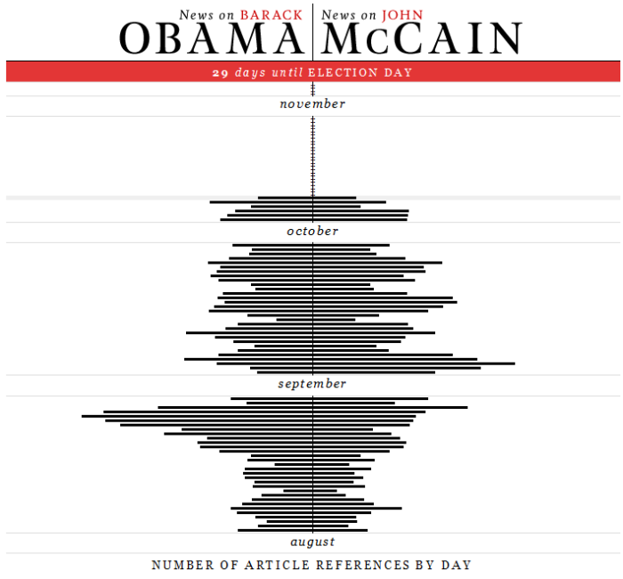
EveryMomentnow.com is a wonderful website that tracks the number of news articles that are focused on one of the presidential candidates. Here is an example visualization from their main page. It reminded me of Tufte’s Sparklines, which convey information so succinctly.
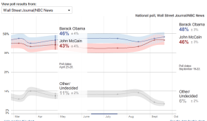
But, New York Times scores a home-run again by making an interactive election visualization that allows readers to explore their data, create your own prediction map and much much more. It even allows you pick different ‘opinion polls’ and see what they’re predicting. Here’s a snapshot from the ‘Wall Street Journal/NBC News’ predictions. It can be found at http://elections.nytimes.com/2008/president/whos-ahead/key-states/map.html
CNN.com has its own version of visualizations for polling and electoral map calculator.
Microsoft’s Live Labs too has developed “Political Streams” which is basically an integrated visualization tool of sorts, that allows one to visualize the attention an event is getting. They divide the ‘attention’ into ‘news’ attention and ‘blog’ attention. It would be more interesting if they would allow users to start their own streams.
Well, I’m happy to see that there has been some significant interest in the academic community as well.
Geoff Draper from the University of Utah will be presenting a paper in the IEEE Information Visualization 2008 conference (which is part of IEEE VisWeek 2008) titled: “Who Votes For What? A Visual Query Language for Opinion Data” by Geoffrey M. Draper & Richard F. Riesenfeld.
Visualization researchers such as Chris Healey from NCSU and Jean Daniel Fekete from INRIA have worked on visualizing election results in the past.
Chris Healey’s 2004 US Presidential Election research: http://www.csc.ncsu.edu/faculty/healey/US_election/
Jean Daniel Fekete’s 2004 French Election related work: http://www.lri.fr/~fekete/elections2004/index.en.html
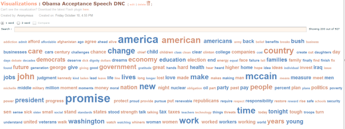
As always, my favorite visualization website, Many Eyes, is full of users trying to visualize everything from
– Palin’s Comments During the VP Debate
– Obama’s Nomination Acceptance Speech at the DNC
Many more such elections related visualization have been created and can be browsed at http://services.alphaworks.ibm.com/manyeyes/browse/visualizations?q=presidential
I feel that even though some visualizations provide interactivity, most of them seem to stay away from using some of the wonderful information visualization research that has been going on to allow users to obtain insight such as the ‘Visual Information Exploration for the Web‘ by Sheelagh Carpendale. I’m sure you have seen some good and bad visualizations this election season. Please feel free to post links or mention them in the comments.
IEEE Visualization 2008 (Vis, InfoVis, VAST) papers posted
The IEEE Visualization 2008 conference will be held in Columbus, Ohio this year. The VGTC committee decided to call the paper presentations, art exhibits, panels, posters, worshops:VisWeek . The idea is to have all the events that are based on data visualization of some sort are clubbed under one event name. Previously, in the past people would attend InfoVis and then leave or attend only Vis (which generally starts on a tuesday/wednesday) and then leave at the end of the week. I think its a great idea that they are allowing attendees to attend the whole week of amazing talks and presentations. I am sure such an endeavor will encourage interactions between people and lead to more interesting results for the community.
Well, as one of the marquee events of the conference, the list of accepted papers for the conference has been posted on their website.
I am keenly looking forward to reading some papers and shall post my thoughts on them as soon as I can my hands on them 🙂
The posters, panels, workshops, tutorials etc links too have been updated. All the links can be found from the main page at http://vis.computer.org/VisWeek2008/
It definitely promises to be a great event. If you have a preprint of an accepted paper that you wouldnt mind linking to, please do so in the comments section.
Which papers are you looking forward to? Do write and let me know.
The preprints of the accepted papers that are online can be found at http://www.cse.ust.hk/~wuyc/Vis08.htm


