Visualization in politics
As the November elections approach, I’ve been observing more and more websites, newspapers and even a few researchers conveying data and trends using visualization techniques.
Fivethirtyeight.com is a website which claims to correctly project election results and one that is getting a lot of media coverage [and on the Colbert report] has a few examples of visualizations.
EveryMomentnow.com is a wonderful website that tracks the number of news articles that are focused on one of the presidential candidates. Here is an example visualization from their main page. It reminded me of Tufte’s Sparklines, which convey information so succinctly.
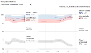
But, New York Times scores a home-run again by making an interactive election visualization that allows readers to explore their data, create your own prediction map and much much more. It even allows you pick different ‘opinion polls’ and see what they’re predicting. Here’s a snapshot from the ‘Wall Street Journal/NBC News’ predictions. It can be found at http://elections.nytimes.com/2008/president/whos-ahead/key-states/map.html
CNN.com has its own version of visualizations for polling and electoral map calculator.
Microsoft’s Live Labs too has developed “Political Streams” which is basically an integrated visualization tool of sorts, that allows one to visualize the attention an event is getting. They divide the ‘attention’ into ‘news’ attention and ‘blog’ attention. It would be more interesting if they would allow users to start their own streams.
Well, I’m happy to see that there has been some significant interest in the academic community as well.
Geoff Draper from the University of Utah will be presenting a paper in the IEEE Information Visualization 2008 conference (which is part of IEEE VisWeek 2008) titled: “Who Votes For What? A Visual Query Language for Opinion Data” by Geoffrey M. Draper & Richard F. Riesenfeld.
Visualization researchers such as Chris Healey from NCSU and Jean Daniel Fekete from INRIA have worked on visualizing election results in the past.
Chris Healey’s 2004 US Presidential Election research: http://www.csc.ncsu.edu/faculty/healey/US_election/
Jean Daniel Fekete’s 2004 French Election related work: http://www.lri.fr/~fekete/elections2004/index.en.html
As always, my favorite visualization website, Many Eyes, is full of users trying to visualize everything from
– Palin’s Comments During the VP Debate
– Obama’s Nomination Acceptance Speech at the DNC
Many more such elections related visualization have been created and can be browsed at http://services.alphaworks.ibm.com/manyeyes/browse/visualizations?q=presidential
I feel that even though some visualizations provide interactivity, most of them seem to stay away from using some of the wonderful information visualization research that has been going on to allow users to obtain insight such as the ‘Visual Information Exploration for the Web‘ by Sheelagh Carpendale. I’m sure you have seen some good and bad visualizations this election season. Please feel free to post links or mention them in the comments.


[…] about coordinating visualizations for exploration of real-world data. Particularly since in the last post on visualization in politics, I mentioned Sheelagh Carpendale’s work for visualizing data for exploration and discovery […]
IEEE Infovis 2008 overview - 1 « Visualization Blog
October 21, 2008 at 8:53 am