Archive for the ‘interactive visualization’ Category
Visualizing disease incidence in the context of socioeconomic factors
Disease incidence is usually connected to biological factors such as genetics, eating habits, exercise and so on. But are there are other socioeconomic factors that influence disease incidence as well? This TED talk from Bill Davenhall inspired us to explore socioeconomic factors that may influence disease incidence.
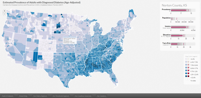
To explore the connections of socioeconomic factors such as education levels, regional population, income level of the area where you live and the air pollution in terms of toxic levels, we developed a visualization tool called DiseaseTrends. DiseaseTrends allows the exploration of possible correlations between those socioeconomic factors with diabetes prevalence and cancer incidence rates across counties throughout the United States. A user can interactively explore these factors at a county, regional (user defined cluster of counties), state or national level.
When a user explicitly selects a county, we display 5 similar counties based on their socioeconomic factors. The motivation behind this feature is to allow users to identify similar counties that may have varying disease incidence rates, which may in turn lead to further exploration.
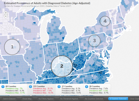
As mentioned above, a user can specify regions manually that cross state boundaries. A user defined circular cluster can be specified using Ctrl on PC, Cmd on Mac – then click and drag. Here the user has specified four regions. The maximum prevalence (in red) and the minimum (in green) across the selected region is highlighted in the panels below.
We use bullet graphs (pdf link) as introduced by Stephen Few to display the quartile distribution of a factor as well as the corresponding state and national average (faint and dark vertical bars).
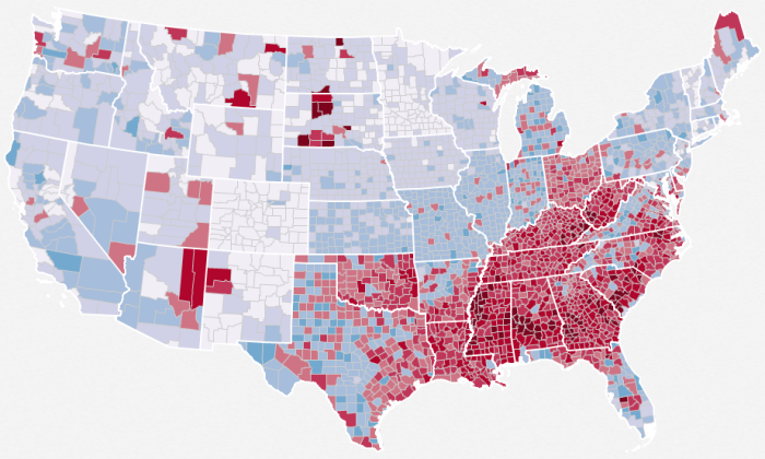
Through this tool, we can easily see the now popular diabetes belt, as shown here
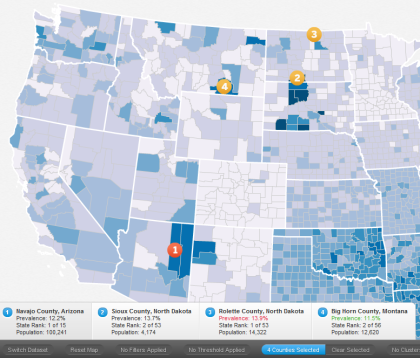
High incidence rates in Native Indian reservations such as Navajo County, Sioux County, Rolette County and Big Horn County too can be seen.
We would like to mention that DiseaseTrends does not imply any causation and can merely hint at possible associations. It is completely up to a researcher in the field of public policy / public health to further investigate the findings.
More details about DiseaseTrends can be found in our paper.
Interactive visualization at your fingertips
 With today’s release of Tableau Public, Tableau Software has opened up infinite possibilites for researchers, corporations and enthusiasts alike to interact, explore and play with their data. More importantly, with Tableau Public one can now have ‘interactive’ visualizations online as opposed to static images. This is a step in the right direction for Data Visualization software, since increasingly one hears from domain experts who want to ‘use’ software and not have to write programs (however small or easy those programs may seem to the developer of the software). Tableau now allows researchers to explore their data and collaborate more effectively instead of having to share static ‘screenshots’ via email.
Such uses of visualization software have already been explored and shown to be hugely successful by the ManyEyes team in their CHI ’08 paper, but the capabilities and strengths of both the products are in somewhat disjoint areas. For example, Tableau focuses on the Business Intelligence community and lacks certain visualizations such as Treemaps or Text visualizations (which ManyEyes seem to do really well). Other interesting and inspiring uses of Tableau Public can be found in their Gallery at http://www.tableausoftware.com/public/gallery. Dont forget to check out the NYC Graffiti workbook that they have online. Detailed training videos can be found at http://www.tableausoftware.com/public/training
ManyEyes – Reader  s of this blog already know my fondness for IBM’s Many Eyes. ManyEyes has been a pioneer in this field of online visualization software that facilitates data visualization without the need for programming. Research papers from the Many Eyes team detailing user interactions and unexpected uses of the visualization software can be found at http://bewitched.com/manyeyes.html
Verifiable is another  such website that allows online visualization of data. So far the data visualizations that are possible are limited to bar charts, scatter plots and line charts but the trend is definitely promising and I hope they continue to improve the excellent service. A video can be found online at http://verifiable.com/screencast
Swivel is similar to  Verifiable, where one can upload data and create online interactive visualizations. Videos for all the features in Swivel can be found at http://www.swivel.com/features. Unfortunately, they have a 15-day free trial that restricts the widespread use of their tools.
As I interact with experts and students from domains as wide as political sciences, biology, economics and so on, I am pleased to hear the awareness that they have for effective visualization but I am sometimes disheartened to have to tell them to learn programming to learn some of our nifty tools. Tableau Public, IBM Many Eyes and others are exceptional in the service that they provide. I envision more research groups, corporate websites and so on posting interactive visualizations with a ‘Powered by Tableau’ icon or something similar in the bottom right corner.
