Visualizing the Swine Flu pandemic
Given the recent news about the outbreak of Swine Flu in many parts of the world, it has been interesting to see what kind of visual representations do newspapers, websites and print media use to convey the spread of the flu.
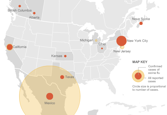
The NYTimes has some very insightful visualizations that provide information regarding the swine flu outbreak in America as well as the world.
America – http://www.nytimes.com/interactive/2009/04/26/us/20090427-flu-graphic.html
World (Updated daily – snapshot shown below)- http://www.nytimes.com/interactive/2009/04/27/us/20090427-flu-update-graphic.html

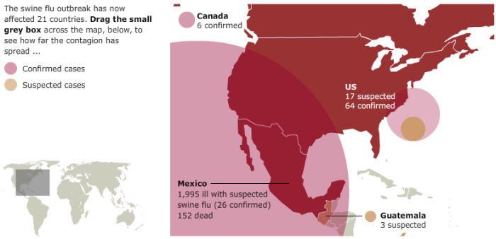
I thought the British Newspaper Guardian did a great job of providing and visualizing the data worldwide. It would have been a bit more interesting if they would have been able to show the entire globe effectively instead of providing the interactive widget, which is a bit limited I think. The link provides an updated visualization, a snapshot of which is shown below
http://www.guardian.co.uk/world/interactive/2009/apr/28/swine-flu-outbreak-mexico-pandemic

Paul Kedrosky’s blog has an interesting mashup of visualizing the flu in Mexico that used Google Trends to visualize the outbreak in parts of Mexico. http://paul.kedrosky.com/archives/2009/04/visualizing_swi.html
You can see what people are twittering about Swine Flu in real time at http://spy.appspot.com/find/swine%20flu%20epidemic?latest=25
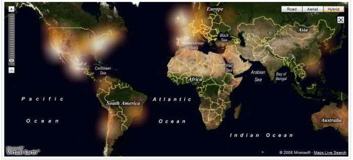
Heatmaps are a widely used visualization technique that is slowly being used widely to convey information. Danyel Fisher from Microsoft Research had discussed their use for drawing a viewer’s attention to a region of interest in his IEEE paper – “Hotmap: Looking at Geographic Attention“, IEEE Computer Society, Nov. 2007 .
The H1N1 Swine Flu Map as shown on UMapper uses Heatmaps to visualize the spread of Swine Flu. A snapshot is shown below, whereas an updated version can be found at http://www.umapper.com/maps/view/id/30340/

Ryan Goodman’s blog has a Google Map’s based visualization of America with information regarding the Flu outbreak in various parts of the country. http://ryangoodman.net/blog/index.php/c14/
HealthMap.org has a comprehensive visual representation of swine flu cases recorded so far – http://www.healthmap.org/en
I wonder if these are still the best ways to visualize the data out there. There is some data on Guardian’s website at http://www.guardian.co.uk/data-store. There is constantly updated data at the World Health Organization’s (WHO) website: http://www.who.int/csr/don/en/ as well as information regarding America at the CDC’s website at http://www.cdc.gov/swineflu/
Have you seen any interesting visualizations that convey the spread better?
[…] Visualizing the Swine Flu pandemic « Visualization Blog […]
links for 2009-04-28 «
April 28, 2009 at 3:30 pm
Hi, we have a map on the BBC website showing the spread of the virus over time (i haven’t worked on it myself but I’m in the same team as the people who have)
http://news.bbc.co.uk/1/hi/world/americas/8021547.stm
Initially we looked at colouring in the countries/ using proportional circles as the Guardian and the NY Times have done but decided that colouring in a large land mass could be misleading (if there’s a case in russia we’d end up colouring half the map) and we weren’t happy with the way proportional circles spread their colour over several countries.
That said, the solution we arrived at – putting numbers all over the place – isn’t ideal and we’ll be reviewing it.
Incidentally we’ve been doing a similar thing for bird flu over the past 4 years
http://news.bbc.co.uk/1/hi/world/7737552.stm
Tom
May 8, 2009 at 10:08 am
I agree with your thoughts on the Guardian and NY Times’ visualization. I too thought that there should be better ways to visualize the data on a global scale without scaring people (like coloring the whole of Russia in red etc). The purpose of the post was to start a discussion and try and find some better visualizations.
Looking forward to visualizations on the BBC website with fewer numbers. Keep us posted!
visualizeit
May 8, 2009 at 2:14 pm
We’ve put up a basic interactive timeline:
http://h1n1.mesaac.com/
No numbers or text as yet, just markers which appear as you move the timeline slider, and which fade as they “age”.
The data is from http://flutracker.rhizalabs.com/
Mitch
May 13, 2009 at 7:24 pm
[…] The top two images show Violence and Voter inconsistencies as reported by users. The bottommost image shows Swine Flu cases all over the world. Such field reporting-based visualizations can be invaluable, especially now that a worldwide swine flu pandemic has been declared by the WHO. In a previous post, we have seen different visual representations of the Swine Flu Pandemic. […]
Empowering people with visualization « Visualization Blog
June 11, 2009 at 11:06 pm